

The above is a preliminary sketch of the Kuwait Airways logo sketched by then acting CEO Harry Pusey in 1958. Pusey was inspired by a bird ready to leave a tree branch while at a cafe in Beirut. This is what he had to say about the logo:
While designing the logo, I had to review the company’s image and develop a new logo and brand identity. Therefore the bird with its beak held high, reflecting my hope that to whichever destinations KU aircraft may fly, it must always be safe in the sky and there must not be any accidents.
The logo is still used by Kuwait Airways today.
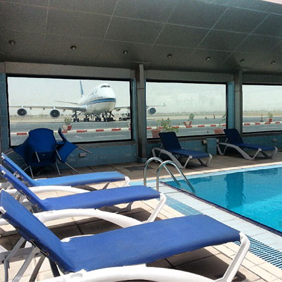
I took the photo above from @kuwaitairways where they also posted the picture below which is a view from the Safir Airport Hotel. That’s an amazing view.
29 replies on “The story behind the Kuwait Airways logo”
His name is the funniest name that i have ever heard
It’s pronounced similar to ‘music’. So it wouldn’t sound like ‘poosey’
ROFL
I always loved Kuwait airways never had a problem with them ever
+1
gtfo
loll.. +1
because he had a nice time with them? logic.
https://johnnyandangus.files.wordpress.com/2010/06/0image-scaled-1000.jpg
I think his parents did a good job at minimizing the damage of having that last name. Better to be called Harry Pusey than “Michael Pussey”, “Jack Pussey” or “Mark Pussey”.
In my view one of the nicest logos ever. I have always loved it – and not just for the affection I hold for KU. I hope the airline is restored to its former glory and please God remind them to maintain the logo when they do.
Thanks for sharing this sketch.
Check this then https://248am.com/mark/kuwait/commercial-bank-of-kuwait-logo/
I like that too – and the story you share makes it richer for me every time I will see Commercial’s logo now. I still prefer the simplicity of the KU logo – I used to sketch it when I was a child and was very meticulous about the dimensions. I think I was almost on the money with the 4×17 units dimensions – but my 90 degrees was a little more generous 🙂
I have a feeling the guy took inspiration from Lufthansa’s logo. Don’t know.. I could be wrong.
Great post on an important piece of Kuwaiti history!
How did he become the CEO of KA with that name ?
hahaha..
I used to travel Kuwait Airways as un-accompanied minor, first class, n the 1960’s, and I have a small bag with Kuwait Airways logo on it from that period of time. Actually the bag dates from when Kuwait Airways first started their operations, and my parents gave it to me to travel with (carry on bag). Over the years, I thought I lost it, then one day my grandmother surprised me by giving it to me. I have it, not sure where I stored it (since I am constantly travelling), as soon as I locate it, I promise to send you a photo of it so you can post it on your blog as part of Kuwait history.
The logo is great, as itself the logo it is a valuable asset to the company.
With the new management things are starting to change to the better, air flights are in time and even many flights flew earlier than the announced time this busy Eid holiday.
Now we as Kuwaities are waiting for new airplanes and new airport and I am sure things will be great for Kuwait Airways starting from there.
Things are slowly changing for the better, I have many sources.
One of the example is KNPC, wasta has been permanently neutralized there, you get in via your education and effort rather than wasta now.
Other parts of the GOV are fitting standardized tests similar to KNPC which is seemingly effective as well.
it doesnt matter what the logo of the airlines company is ..!! cause kuwait airlines still the worst between Gulf and arab airlines ..
The logo applies KISS perfectly ….
Keep
It
Simple
Stupid
Simplicity at its best.
Very beautiful logo. I love it. Always have felt a warm cozy feeling when I see that sign.
+1
I still feel that way as well. I attribute it to nostalgia though. I hope they keep the logo.
I thought it represented a wishbone.
Makes sense tho.. Wishbones are a part of birds too!
Wishbones represent armors (( which similarly means flying safe))
but what type of bird is it ?
As a logo designer (branding specialist) I think the designer of the logo did NOT came with an original idea, and it must be mentioned here that he was affected in away or another or even stolen from the bird like logo of the famous American bus building company Bluebird which was one of the booming companies at that time.
Agree 1000% It was a stolen idea.
Blue Bird Body Company was founded in 1932 in Fort Valley, State of Georgia, USA as A.L. Luce closed his automobile dealership to concentrate exclusively on bus production.
Where was Mr Pusey in 1932? He must’ve been a teenager.
@kuwaitairways