Now they should just stop using sodium oxybate on their chicken!
[.x.]i fink tht the one we r using at the moment is nice i dnt like tht new design dere i fink it looks odd and more boring! i like the coulurs on the original one and i dont like the way people change the logs or names of shops all the tym i dnt c y they cant jus keep them the same! ne ways thts all from me [.x.]
oh the new logo is off the chain…it is goin to look good on the hood of my racecar…
 2:48AM - Entertaining Kuwait since 2003
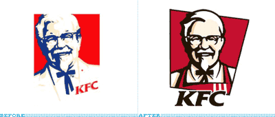
19 replies on “New KFC Logo”
this logo is much better….. now maybe they shud try using real chicken!
are they going to change it in kuwait??
I always used to eat KFC in the states.. because I liked chicken! It tasted damn good! Here Im a bit iffy about it! Just afraid of food poisoning!
hmm i don’t like it. now he looks more anime.
Hmm…Insteresting.
Looks like the Colonel has had a face lift!
😀
they should spike his hair to give him a modern look!
they should go back to the 80’s logo. That’s better than both.
:: The Worker
They should’ve made him look clinically obese.
Like most of their customers.
I agree with mark this a revamp logo that actually looks better than its predecessor.
Looks like the Colonel did some exercise to loose weight.
The old used to look like Saddam Hussein!!!!!
Well, I would have gone for the KGB one.
https://mooodi.ath.cx/pub/kfcg.jpg
is it me or is he cross-eyed?
Now they should just stop using sodium oxybate on their chicken!
[.x.]i fink tht the one we r using at the moment is nice i dnt like tht new design dere i fink it looks odd and more boring! i like the coulurs on the original one and i dont like the way people change the logs or names of shops all the tym i dnt c y they cant jus keep them the same! ne ways thts all from me [.x.]
oh the new logo is off the chain…it is goin to look good on the hood of my racecar…