
For the past two days I’ve been working on a redesigned template for this blog. I really don’t have any major problem with the current design but I do think there are a couple of areas that does need addressing. I was planning on working on the redesign in secret and then overnight just surprise everyone with the makeover but I decided going the other route. If large companies like CNN and Amazon are allowing their users to see and give feedback of their redesign while still in progress why can’t I?
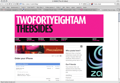
Now I still have a lot more work to do on the redesign but you can take a peak at it by going to unex-t.com/blog. This is more or less how the new redesigned site will look like, most of the changes I am currently working on are the smaller details. I probably will replace the header with a newer one, I might not, I am still not sure about that. At one point I was actually thinking of rebranding from 248AM.com to markandnat.com but decided against it the last minute.
Anyway your feedback is welcomed, I still have a lot of work to do and might take your ideas into consideration. Keep in mind there are a lot of things that aren’t working yet or looking strange on the test site. [Link]
Update: Here is a screenshot of how the new design might look with a black background. I am finding it a bit claustrophobic compared to the white background version. [Picture]
Update 2: Here is another option with a black background which I think works better than the version in the first update but I think I still prefer the full white background. [Picture]
73 replies on “A redesign”
I prefer the normal one. It’s simple and nice!
I dont like 2 things for the new theme:
the width of the new one is too large and the white background for the theme.. i think black is much better..
I love it, not too many changes , which is the right move. and I like that you removed the black background
the new look looks nice but my opinion is that you should stay with the black borders…
the new header also looks very nice…:)
You know Mark, Today i bought my Macbook Pro, and honestly, since now i’m using Firefox on Windows, your blogs looks way too nice on Safari, so a little change won’t hurts especially that this site is in its 3rd year.
I’m with the Change.
I actually prefer the black borders myself since it gives the blog an edge like a sheet of paper. But I ran into trouble while trying to replicate that on the new design.
The biggest change is less clutter in the sidebar. Currently I have all the categories listed and they take up too much space and I doubt anyone uses them. With the new design the categories only show up when you click on the Archive button on the top.
Also I am not trying to completely change the way the site looks. I hate it when people do that. When you get used to a certain design you usually don’t want a drastic change. The new redesign is meant to resemble the current design just with minor changes here and there to help improve things.
:: Stick with the current one. Does not mean that the new theme is not that good ! but i hate the whity background thing, I think you need to resize the banner to smaller size and put the icons (pages) just like the new theme that u are working with.
Good luck & wish you the best 🙂
Yeah, well the archive button is better, as long as anyone could reach the Categories/Sections.
and i think if you did the white boarder, it would be too whitey, but the header is very nice its a must change.
I like it, but why has everything moved to the left? The right looks kinda empty. Your blog used to be centered on my screen, now the text of each entry is a little too far to the left.
I like the design though.
omg the white background kills me, i even can’t read any word.
plz stick with black.
I actually really like the new format. It’s cleaner, brighter, and–as opposed to what a lot here have been saying–is much easier to read. I especially like that you use a much clearer and bigger font–the ones you use now are killing me (and I’m only 22!)!
My one suggestion: allow images in the RSS feed. Otherwise, keep up the good work!
keep it simple .
and don’t change the name
good luck
The one thing I really hate about the test design is the background, you need a color in there. White on White kills the eyes!
I love the new look menu header tho 😀
Good luck & don’t change 248am 😀
Change is always good. I like the new design. Stay with 248am though. This brand is well known now. I think you should stick with it.
There are a few themes that might work better than this one for you, because you use your sidebars for advertising, I think that you should keep that in mind when changing designs, and if you don’t want a drastic change then the only change to your header could be a fresh look on the color and such, lemme browse through the sites that I know and give you a nice theme.
Note: The magenta color will not change! lol
I prefer the black borders on the side, it looks less dull..
the new header is really nice, but it would be cool if there wasn’t a white gap between the header and the black area for links..
also like that there are links on the bottom too
The new one looks to crowded, prefer a simple one…
Out of subject, anyone know where i can find Coghlan’s products in Kuwait? (outdoor accessories)
Just sent you an email through your site regarding the Templates I thought would work better for you 🙂 Enjoy
Yup just replied back, didn’t like them.
Just don’t change the mark248am1.wpenginepowered.com
=]
keep it, don`t change any think
but only change the pink colour to blue or any colour
i like the old one better but i think u should make the links open in new taps or windows
The old one is alot better and simple
Add some java navigation, flaming skull animations, and some background midis. Or you could go the functional route and replace the whole thing with a flash-based site.
I like the old layout better,,, however you may consider 2 things:
– Make the banner smaller
– Widen the margins few millimeters
Eventually, whatever you decide, its the content that really matters
Good Luck,,
You mean the pink color won’t change! lol!
I think the new look is cool but let Jacqui give you some options in regards to the theme that would apply!
what mark and nat ???
you can call it “markandsometimesnat.com” instead !!!
we rarely see her blogging.
Dear Mark,
In my point of view, you really are heading to the right direction of the definition of a professional web site interface. As far you have reached it’s quite good job so far. Many ideas can be implements but from the main changes happened it looks really good 🙂
I think I am going to take Thamers advice lol
IMO, a bit white. try the black bg so that the menu bar blends into it and turns on when you roll over.
I like, Its nice, its simple, and it professional just throw in a little black and it will be perfect inshallah
loved the new design…its good that u didnt change the logo thing header
here is how it might look like with a black background. kinda gloomy.
https://248am.com/images/howitmightlook.jpg
well as a designer i have some issue.
Navigation bar:
1.when i rollover the link on the main menu it gives a horizontal scroll bar, which is quite weird.
2.The shade of black is too much of black in the navigation bar , its taking most of our attention.
3.On rollover the link pink background appear which initially hiding your navigation description which is written in pink font.
Body:
3 Columns design is a nice idea. because it gives more space to your design but it would more cool and user friendly if the second column is being differentiate from the 1st and 3rd column by giving some colors or may be giving a different light background.
Over all nice but the theme need a solid or illustrated background. So that it highlight the content in the page.
Hope these comments will come into a count.
Choose something other then a black background!
adding some “icons – ? ” would be nice (i.e Kuwait Weather, Headline News, Joke/Quote of the day etc etc)
i cant leave a reply for the past 3 days.. i wonder why?
i needed to add a “.” between mush and room before i could post. anyways regarding your new site, adding some icons?- i dont know the exact term, like kuwait weather, headline news, joke of the day would be nice i guess..
mushroom, for some reason your comments were going straight into spam. i removed them from the spam but if it happens again email me so i can see into it.
Sam, thanks, thats a great suggestion, i just changed the middle column to a light shade of grey in photoshop and it looked great. will try to apply it to the template now.
mark you seems going to replace the black even 90% of your readers prefer it.
why not make a simple option for black OR white interface instead of force that stupid “all white” look.
keep it 2 columns rather than 3…
Keep the current template, reduce the sections and cleanup some ad spaces as they tend to interfere with the overall content. I suggest you reduce the amount of ads and increase your rate card, or have them roll over in one spot and instead sell by hours just like yahoo, cnn etc.
Keeping the current template is out of the question. Now that I’ve been playing with the new template there is no way I can stick to the current one. The coding on the new template is wayy cleaner and a lot of issues i had with the current template are getting fixed there.
About reducing the amount of Ads, I would rather not do that. I don’t think rollover ads are effective, the same way I dont think the outdoor prismas here in Kuwait are effective. Its stronger for the brand not to share the space.
add a عربي button. Also post prayer times, current temp, tides and sunrise/sunset. maybe horoscope if ur feeling frisky.
I disagree Holla. I think that;s overdoing it.
Holla was just making fun out of mushroom
errr….
anyways, when do we expect to see the new look of your site?
when its ready
Two things:
1) The black is nice but there’s no need to add the extra row (i.e. my opinions, previous posts etc.) Choose one row or the other. So either “my opinions” or “reviews” and not both. In all cases, I don’t like the small letters aspect, it looks messy or unfinished.
2)The Jacques Dessanges ad makes this look like a beauty blog at first glance. You put too much emphasis on any ad by putting it right under the main headings. I suggest removing it and putting elsewhere so that at least the first thing we can see the is title of the post.
i think u must go for colorful one…cuz if u decide to make a changes u should make a difference. and i think u should creat a logo(small and simple)..about the pink,plzzzzz change it, try the yellow
Mark,
You have WE to come up with many suggestion but the final have to be taken by you. Best of luck. Hoping to look forward.
I agree with Sam’s comments! As for the background choose a color which gives contrast but isnt blinding! The black is too damn black!
*Note: THe Zain Ad has horrible colors!
The menu bar needs to be cleaned up a bit, the black is overpowering the words inside of it! Choose a different shade or color!
I think the only visual change i will do is change the color of the second column to grey like this
https://248am.com/images/greybar.jpg
The new template’s kinda weird. The font doesn’t seem so good.
And the black is perfect! Don’t change it!
Marzouq’s blog is very cool in design and content. I think the design tips, zouq can help!:)
Looks much better Mark.
Waiting for the live demo.
Hope the in the navigation bar the menu will be vertically middle or center align . 🙂
As mpJs said the black looks great.
the grey column definitely looks better…..but i really think u should stick with a black background…….the white background just makes things look to open, and hard to read….
i still think you should try removing that gap of white space between the header and the links…
its there for aesthetic reasons. it helps tone down the black navigation bar.
I’m going to do a redesign myself and I’m going for the three column look as well with some interesting changes!
Hi marc!
I suggest to add a box in the right column that displays the titles of the last 5 posts in the message board. I think that this idea may attract more visitors to the board and integrate it to the blog.
Steven, good idea, will see if i can find a plugin for it.
i wasn’t making fun of mushroom! i was just making fun in general. u also need to put up the emergency no incase someone forgets it’s 777 😀
I like the 3 columns but why cant your blog be centered as the middle column.
you didnt change much.
how about a new color scheme?
different font?
different headings?
a new title?
a life?
;p
much better with the black bg, the white is way too overpowering and you’d end up blinding ppl!
there is something abt the side bar I dont like, I’m not sure if its the font I dunno!
anyway good luck & take on board everyone’s views
I don’t care about the design as long as you post good stuff!
the black background looks alot better, so try to leave it..
i like the way it looks now, i think its perfect but a little change wont hurt..
but deff. keep the black background.. it suits it ! 🙂
Dude, keep the black border whatever you do. The white is really painful to read against. 99% of people have agreed.
the menu on top the links looks like google add’s it could confuse alot of visiters probly centre it n make it bottom look other than that everything is great :). jst an idea.
If you put up the 777 no, you might as well put up a disclaimer saying you don’t guarantee them asnwering in the first place 😉