
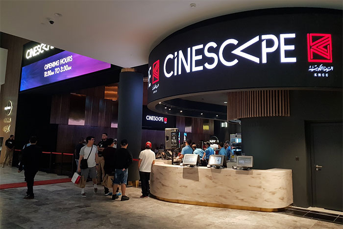
Over the years Cinescape has gotten multiple of new logos with the last one being in 2014. My first impression, I don’t think I like it. I think my biggest issue with the new logo is that it’s two different logos slapped together to make one.

The red icon with KNCC written under it is the logo of the Kuwait National Cinema Company. Then you have the Cinescape wording with its unique typeface and sideways letter A “<" forming a secondary logo. In usage, they're either using the wording Cinescape with the KNCC icon combined as above, or they're using the < as their icon by itself. So they're flip-flopping between two icons constantly and that seems messy. I also see the shape < in two places, the first in the Cinescape wording and in the second in the red KNCC icon which makes it repetitive.

Their previous logo didn’t have the KNCC logo attached to it so not sure why they’ve attaching it now in this one. Personally, I think I might have preferred it simpler like in my mockup above. That way they can use the < as their icon when they want to and not have a secondary confusing icon next to the brand. I'm curious to see how the brand will develop over the next few months once all their theaters get the new facelift.
11 replies on “Cinescape Have a New Logo”
If they fixed the lowercase “i” by making it uppercase and removed the slant in the “P”, the logo would be even better. But because the Arabic logo is weak on its own and has no gimmick like the <, they're forced to include a lower case letter and a weird slant to make a connection between the two.
clearly, they are obsessed with the < shape because it represents the light rays coming out of a cinema projector.
personally, i don't like these weird shapes between normal lettering because sometimes they use odd fonts and it makes things on websites display weird, but whatever. *shrug*
Just a suggestion from my side. I believe, the title “Cinescape has a new logo” would have been appropriate.
+1
KNCC launches rebranded Cinescape
More details:
1.
tradearabia.com/touch/article/MEDIA/344128
2.
news.kuwaittimes.net/website/kuwait-national-cinema-company-launches-re-imagined-cinescape-brand-ahead-of-eid-al-adha/
KNCC launches rebranded Cinescape
More details:
1.
https://tradearabia.com/touch/article/MEDIA/344128
2.
https://news.kuwaittimes.net/website/kuwait-national-cinema-company-launches-re-imagined-cinescape-brand-ahead-of-eid-al-adha/
Why such a fuss? It’s a logo, it’s not like they are going to change the censorship or thing that actually matters.
looks similar to another logo
Dont forget the < comming from the K in the arabic kaaf letter in arabic
Logo’s matter and while I agree with Mark, the fact is its here to stay for a while and with everything (including drastic facelifts of our favorite cars) – we’ll get used to it.
That said Cinescape has been a gem to Kuwait’s crown and VOX have laid a challenge to it (Grand and Sky don’t count IMO) While they don’t have the spread yet outside of the avenues, the bells are a tolling so they need to start somewhere. They made baby steps before their entry with 4DX and other new technologies and need to make measured investments – measured because Kuwait until UAE is conservative and censors movies killing the essence of most plots.
To be fair, the new logo is not all that bad. What I like most of all is their new service tag line: Love All. Respect All.- something we could all use in our lives.