The new identity looks pretty good but next thing they should do is redesign their money notes since they look pretty outdated compared to the rest of Dubai. [Link]
 2:48AM - Entertaining Kuwait since 2003
The new identity looks pretty good but next thing they should do is redesign their money notes since they look pretty outdated compared to the rest of Dubai. [Link]
16 replies on “Dubai Airport Rebrands”
Looks really great.
i like the kuwaity airport’s corporate identity better.
It looks good!! I agree with you on the money thing!
good redesign of logo – still sh*t airport
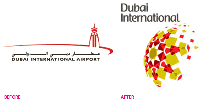
I like it, but the half sphere is disproportionately large vis-à-vis the text. They need to shrink it a bit.
Good luck
the money has been redesigned a few times before.. especially with the introduction of the 200 bill almost a decade ago, but i agree that it needs to be redesigned. coz the last design involved just a change of font and added security features. the layout stayed the same.
anyway i am an old fashioned guy, and i quite like the money as it is. as a matter of fact i have some old-design notes direct from the mint and they can give u one hell of a paper cut and smell rosy.. i won’t use them. 🙂
btw, nice new logo for the dubai airport. i like it.
OI! Nobody disses the dirham, capiche?
But back to the brand….I like the Arabesque hemisphere thingy a lot. The font, not so much. It all doesn’t matter anyway–DXB sucks big, fat ass.
It’s not that new, I saw it back in 2007.
Thanks anyway..
Its a month old so its new.
What does the logo represent
I also like it but it has nothing to do with the airport itself
logo reprisent Dubai – big balloon with full hot air.
The best notes design ever. https://www.banknotes.com/CH190.JPG
They also have the best passport
https://upload.wikimedia.org/wikipedia/commons/thumb/6/6f/Swiss_passport.jpg/439px-Swiss_passport.jpg
wow, I like it
Wow its very interesting anybody knows who is the branding firm???