
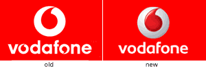
Sigh, another logo crosses over to the 3D button style. Just barely over a month ago I posted about Quarks new logo which looks like a button and now Vodafone went ahead and did the same thing. The new redesign looks OK even though I don’t like the 3D effect in general. I also prefer the new typeface since I used to think having the logo in place of the O’s was a bit too repetetive in the old logo so thats cool. In general though, they don’t make logos like they used to.
6 replies on “Vodafone Rebranding”
thx for linking to your excellent older post on Commercial Bank. I agree with your sentiments completely.
I guess it’s becomin’ a trend. Quark, Volvo and now even Vodafone. All metalic and 3D. I love 2d vector/solid shapes better, anyways.
I like their new 3D logo!
I like the old logo, the 3d logo looks kinda ugly to me, well thats my personal openion. Excuse me on that. 🙂
Hey Mark,
Enterprise IG or in-house? I like the logo type…RE-BRANDING MANIA!!! everywhere
I’ve always liked the vodafone logo, 3d sucks, but gotta agree with mark on this one, dropping the o’s makes it look alot cleaner.