
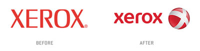
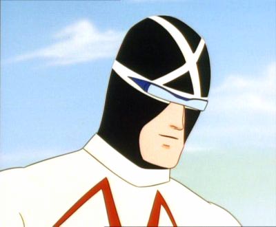
Xerox launched a new identity and I really don’t like it, the sphere with the web 2.0 glossy effect is never going to be a classic. The only thing I like about the logo is that it reminds me of Racer X (picture below) from the cartoon Speed Racer. [Link]
11 replies on “Xerox rebrands, becomes Racer X”
Nice!….Sleek, sharp and pretty interesting. Certainly a lot better than a lot of the recent junk we’ve seen.
8 / 10
Thanks K.
Anytime Mark.
K I already knew about the rebranding from yesterday, it was posted on advertising/design goodness. You’re too slow!
https://www.frederiksamuel.com/blog/2008/01/xerox-rebranding.html
I always liked that cartoon, the main character was kind of fruity though with the scarf and puppy eyes.
Racer X was fucking cool!!!
i think they should lose the sphere, the logo type looks good on its own
actually it looks like a ball covered with white strings
New Logo More Powerful and Web 2.0 😉
Some cartoons and comics are not made to be live-action movies. I cannot imagine that Speed Racer will work without a certain something being ‘lost in translation’. My other favourite, apart from Tintin and Asterix comics, is Samurai Jack on TCN. None of these have worked/would work in live action.
Unfortunately no one can be told what web 2.0 is, you have to see it for yourself…
xbox 360 anyone?