
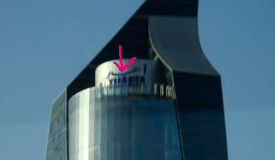
One of my favorite skyscrapers in Kuwait just got slapped on with a tacky blue signage right on the top. Wasn’t there a nicer way to do it? I’ve noticed a lot of buildings use this blue cheap looking plastic for the building names but it really ruins the look, there must be a better or more tasteful material that can be used.
Note: Sorry about the blurry photo
23 replies on “And they ruined it”
This building look awesome only in B&W .. like the one u linked (monolith)
I think the blue blocks looks just fine !
Mark 😐
About the giveaways… I’ve been trying my best to enter but am unsuccessful. Thing is, I’m online only from work throughout the day and never in the evenings/nights from home. And when I check your blog in the morning, there is a draw that I’ve missed and a winner decided already.
To cut the crap… can you please extend a give-away for at least 24 hrs rather than for a few hours every evening?
This way maybe I can win your wrangler, ducati or some cool gadgets when you put them up 😉
The giveaways always end in the evening. Yesterday it started at like 12pm and ended at like 9pm. I can’t have it open for 24 hours sorry.
That sign looks ugly.
Mark i was like WTF… early morning today while heading to sharq they really did ruin it i hope they read this and re doo the sign its such a loss
No problem Mark… 9 days at home from tomorrow 😀
At least now I have a chance!
I think they ruined it when the Tip of the curve at the top was not smoothed out..
It seems as if they ended it in a hurry!
what’s the sign say ?
I think “Al Tijaria”
I’m guessing that the marketing manager and the architect probably never met
I dont see whats wrong in the picture. Ill try to pay attention when i pass by it today
These are the same guys who ruined the Lateefa Towers (once Kuwait’s tallest residential towers) in Mahboola.
Same logo there too! Not just the logo but even the ugly blue lights at night are far worse than how they once shown bright at night and were visible from pretty far away.
At least they dont have a neon plastic palm tree on top 🙂
What’s the point of putting a name on a tower, and all the way on top. You don’t see this anywhere else in the world.
the secret word is cheap, u said it.. everybody likes it.. as long as its cheap then that’s what they want not how it looks on a multi-million project.
agreed, looks crap
i saw it 2day cuz i just came back 4m egypt , it’s disappointing! this builting is one of ma fav.s too the name looks stupid
Yeah!! i past by that skysraper it was UGLY
I thought I’m the only one who noticed it! I agree with you, it doesn’t match at all.
i think its ok
I think the sign should be changed, and it must read “The Hand of NOD” =]
That aluminium with blue lettering used to be modern, about 5 years ago, now it’s just cliche and we’ve seen it so much that we don’t appreciate it anymore. Plus, building a pretty skyscraper then ruining it with and ad on top cheapens everything about the building. I agree with Zaydoun, “the marketing manager and the architect probably never met.”