
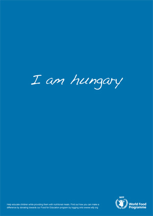
Here are two layouts from the Young Lions competition. For those who missed my previous post, we needed to promote the WFP “Food for Education” program with our ads.
The body copy for the “I am hungary” one says:
Help educate children while providing them with nutritional meals. Find out how you can make a difference by donating towards our Food for Education program by logging onto www.wfp.org
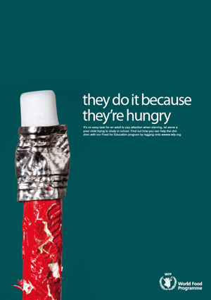
The second layout the body copy and the headline wasn’t finalized because we killed the idea in the end. Supposedly the gold winner at the competition had a similar idea with the bitten pencil but I haven’t seen that layout yet to know exactly how close we were to winning gold.
27 replies on “I am hungary”
The second layout is so much better than the first. You should have gone with it. The first one has nothing special about it but the second makes a point.
did not get the second ad?
Hungary-The new nation of starvation?!
Very professional work! good job mark
nice, but the second ad will be more pro if you make it “..because they’re hungry”
I didn’t get the first ad and I am Hungarian
man, i can’t believe you killed the second idea, it’s great, the layout and the colour is beautiful .. and it’s remind me of one of my favourite ads, for “Parker pen”, it’s called “you are what you eat”.. i couldn’t find the ad on the net, but i have a copy, i will post in my blog later in case you want to see it.
anyway hard luck, you did a great job.
why didn’t they bite the white eraser head end thing? it’s tastier than wood..KIDDING
you spent 9 hours doing those?
Damn, man that is a bitter ending! I don’t know what to tell you, it looks good but at that point you have a million ideas going through your head and your under pressure! I hope you win another competition!
If you haven’t mentioned it, I wouldn’t have figured out it’s a bitten pencil by just looking at the ad. But I really like the idea.
Can’t we view a better resolution of the layouts?
I think the 2nd ad is amazing!!!! i bet if u make it and put it around in Kuwait it will grab alot of attention
I second that Pearls! but agian, do we really bite pencils bcoz we r hungry!
Dude…you should have kept the hungary as hungry…it takes a while for people to make out that its meant to be a kid who wrote that (explaining the sp. mistake) particularly as the handwriting is not that childlike.
The second image was great…but you should ideally change the caption to something shorter and stronger.
I think you complicated the ads a bit too much.
nice layouts but creativity wise…seen better, I immediately thought about hungaria for the first any related stuff? for the second, I think that kids who are hungry do not have pencils and dont even go to school…
and the eraser of the pencil is too shiny…
They’re really creative, keep up the good work. I guess you could have improved your final ad by changing the wording to I’m Hungary as it makes your message clearer. You could have also increased the size of the WFP logo.
Btw did you bite off the pencil or was it one of the pictures provided ?
is it hungry or hungary? im confused, i cant tell if its a typo or if you did it on purpose
hungary as in an intended typo, kind of typos kids do to emphasize the fact that children wrote it.
Hope i got it right 🙂
Great work, shame you killed the second ad because it is much clearer and gives a powerful message.
Best of luck in your next competitions.
thanks for the feedback, i will try to answer some of your comments.
The idea behind the first ad is to highlight two things:
– hungry misspelled as hungary focuses on the lack of education since the kid couldnt spell hungry
– the fact that the kid is saying he is hungry focuses on the starvation aspect
The second layout was killed because it didn’t make sense. We are saying the kid is hungry thats why he is biting the pencil.. fine. but if he is biting the pencil he is doing so while in class which means he is in school which means he is being fed by the WFP so why is he hungry?
The reason its “I am hungary” and not “i’m hungary” is because kids still learning in school wouldn’t use i’m.
For the I am hungary ad I would have rather had a more childish handwriting but (a) we had to use the fonts available on the computer and we couldnt download or install new ones. (b) we couldn’t scribble it on a paper and then scan it and use it in the ad. Luckily we found a typeface that looks like a handwriting or that ad would have been killed.
although the second ad is visually stronger then the first one, it was weaker concept wise. you can’t have a pretty ad which doesn’t answer the brief.
whoever said make the logo bigger better have been kidding! lol
The first ad is simple, yet effective.
But, as you mentioned, it would’ve been monumentally more powerful had you been able to have “I am hungary” handwritten with a kid’s writing.
The message would touch the heart more strongly then.
I got the first ad immediately, but not the second one. BUT- the handwriting should have been more childlike (i know why u couldn’t though), and I think it would have made more sense to a lot of other people if, say, hungary was crossed out and hungry written next to it. There is a standard font that looks like kiddie handwriting, Kirsten, I think?
the quality of the image is amazing, i think it would’ve been better if the rubber eraser was chewed too.
and instead of the lond phrase, you can just use: hungry ? or : because they’re hungry.
as for the type-face, you could’ve generated your own type-face.. was it allowed ?
good job though, i would kill to see those type of strong yet simple designs here in kuwait.
Hard luck and congrats for being able to make it there. I’m sure it was a great experience, which matters more than winning.
From my end, both ads are good concepts, but not winning concepts.
The first ad has a fancy font, too fancy for child who is so hungry, plus it’s confusing and not very direct, which means the concept is dead. I understand that you guys had a limited list of fonts but, if that was the case, drop the idea and move on to something else, or use a drawing tool to create a hand-written font on screen. The point is to come up with an effective concept using the tools you are provided. THAT is where the creativity comes from. You cannot blame the ineffectiveness of your first-choice submission on your lack of tools because that was the whole point of the competition.
The second concept has been done before for different products. Good use of colours though, but again a hungry child would not have such a pencil to chew on. That makes the whole concept moot.
Anyway, congrats again, for the thought and efforts.
I think an ad’s message should be clear right away. “I am hungary” makes most people think of the country. I think saying the typo is supposed to make one think of uneducated children is a stretch… 1. all children (educated or not) misspell words; 2. “hungary” is an actual word, so the “typo” is not immediatelty understood. And like others have pointed out, the handwriting is clearly not that of a child… so there are way to many inconsistencies to generate a cohesive idea. As for the other one… portraying starvation with a chewed up pencil? It just seems inappropriate, for lack of a better word. It has nothing to do with hunger… and it takes the gravity out of the intended message. I hope you take the intention of most of the comments on this post in the right way – as constructive criticism… too often people get so caught up in defensiveness that they cannot stand to see that others may have good ideas too.
support them…shell we