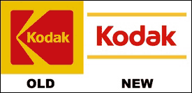
It seems every company that redesigns their old logo ends up with one thats worse then the original. AT&T anyone? I think the new Kodak logo lacks personality and uniqueness. It looks older then the logo its replacing. Classics should not be messed with. [Link]

11 replies on “Kodak’s New Logo”
Yeah, their old logo was a classic. 🙁
eeew whoever designed the new one should be shot!
I think the kodak people should be shot, because they accepted such work. The old logo is much better, all they did with the new is change the font. I still find the old one more creative than the new. At least let them change to somethin better.
sorry guys i know this is an OT but i know that most are you r here in kuwait just want to know dose this device work here in kuwait ?!
https://www.envioustechnology.com/index.php?c=mobix&sc=mobix&p=475
does it gets an arabsat or nilesat ?
what does they mean by DVB-T Reciever
?
btw the product name is “Mobix DVB-T Reciever”.
Thanks in advanced.
^^^
what the fuck?
great and simple
the old is fucking ugly with dark yellow
Hey Some 1 do you mean this device from gadget basement?
https://www.gadgetbasement.com/index.php?c=moshi&p=380
it picks up digital TV (DVB-T freeview)
Fiz yes this what i mean ! and what do you mean by ? digital TV (DVB-T freeview) ??! is it like a normal home reciever ?! ArabSat & NileSat ?
Nooooo!
But I do like the new at&t logo.
Kodak is a Great American (ICON!). What?, are you people stupid or what!!!! Did your so called MBA’s and Ad Guru’s lean nothing from Coke’s big screw up!!! You don’t miss with our American (ICON’s) Dumb Ass!!! Put the Eastman Kodak logo back like it was.
Kodak is a Great American (ICON!). What?, are you people stupid or what!!!! Did your so called MBA’s and Ad Guru’s lean nothing from Coke’s big screw up!!! You don’t miss with our American (ICON’s) Bone Head!!! Put the Eastman Kodak logo back like it was.