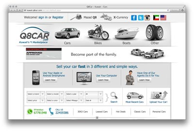
I’d say it’s just slightly better than their previous version. The colors are much more subtle but I think all the graphics and icons are a bit too big and bulky. You can check it out yourself [Here]
 2:48AM - Entertaining Kuwait since 2003
I’d say it’s just slightly better than their previous version. The colors are much more subtle but I think all the graphics and icons are a bit too big and bulky. You can check it out yourself [Here]
8 replies on “Q8Car Redesigns”
Typical case of going from bad to worse.
Blah.
A step in the right direction and it’s smoother and faster than before. Like the colors but some simplification is needed.
I’m surprised it doesn’t have the water reflection effect and “beta” everywhere because that’s right around the time (3 years ago), that this sort of “big icon” design was in fashion.
Well, at least it isn’t as bad as their previous design; that’s something.
I wouldnt say its faster … the site feels so heavy to load … especially thumbnails of cars …
What’s a Hona Harely??????
https://kuwait.q8car.com/en/motorcycles/honda/harely/2010/117199/itemdetails.aspx
Its definitely nicer. Mark should change colors on his blog too.
The price location is wrong, even if transparent it covers the car. Needs tweeking
Too bad the old site had a link to view in english