
The Choowy Goowy website has been redesigned. It’s now flash based (urgh!!!) but the site does look much better than it did before. They have all their latest cookie flavors listed including our Mark & Nat oreo cookies. So check out their website and leave any comments or feedback on the new design below. [Link]
33 replies on “Choowy Goowy website redesigned”
slow=bad
flash=slow
slow=bad
flash=bad 🙂
I got bored at the intro screen itself.
vampire – cajie
thank u for ur feed back ,
us as choowygoowy we see the over all picture , we have designed the site in away that is realted to our concept and theme , the intro can give all what do we have from product if u dont want to see it u can skip the intro. anyway i would like to thank u again for ur feed back
They have to keep in mind that not all viewers have high speed internet. I’m running into some issues since its slow and your better off going with a non-flash based site for viewing purposes and orderin purposes.
The Redesign is good since their website was inconsistent previously. I like this new look, but you should give the user two options to go with a non-flash a flash based website.
The only thing that matters is you guys have damn good brownies… I mean addictive!
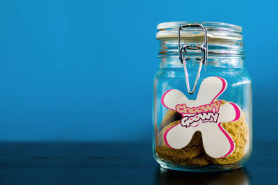
How large is the cookie? The same size as Hardee’s? Or smaller? And how many pieces in each jar, ten?
smaller than the hardees cookies , a dozen in each jar , thank u marzouq for ur feed back great idea ,
Slow loading, quite a few typos, grammatical errors in the 2 paragraphs under ‘Profile’, music doesnt loop well.
A lot of work has gone into it but the site just doesnt seem polished enough
..Chocolate sauce… brownies… mmmm…
aww I love Flash; teh new design is lovelaih
laish bas tsawoon 7ag Mark o Nat Oreo cookies??
make me Snickers ones and call it iNoor
I am such a cookie monster. I love cookies… and Choowy Goowy not only yummy but they are also culturally responsible.
Where I work they distribute cookies to employees for free which really does brighten my dad.. also during Lebanese war they were selling cookies for us and ALL the money would go to Lebanon for good cause..
Plus the variety is SO YUMMY! I am so tempted to order from them now… heehee
brighten my dad LOL and maybe my dad too 😛
Having sugar boost at work really works heehee
I meant DAY I keep typing DAD.. the sound effects of fasting and waiting for futoor (which is in less than 10 mins)
cool redesigning, I hate flash most of the time, but for your website is ok. the website much better looking now . however, you should consider adding a music off button somewhere, because its loud. keep the cookies coming!
The website is lacking information .. I kept trying to click on the pictures thinking they were links. It looks pretty tho, just a bit busy.
sorry but the design sucks, there is no concept its a bunch of redundant repetition with different colors. the intro isnt really an intro, its too streched forcing everyone to see the whole variety and i agree with KtheKuwaiti, it lacks alot of information and lacks the visual hierarchy, but right now its a mess that the designer claims it to be design. check diesel.com and see how things dont get to be a mess.
i love thier cookies i just wish if u can try them out with all thier flavours before ordering… like if they had a store 🙂
Good design I must say, I just have a couple of comments.
– Since you gave the visitors the option to decrease/increase the sound in the intro. page, I think you should also give the option of disabling the music altogether. A turn on/off button for the music should be there!
– I think if the cookies presented in the intro. were clickable and each one takes you to a page which gives you more information about that cookie, it would really be much better..
– Also in the main page when you enter the cookies section and get the list of the 11 different cookies available, you cannot go further to know more about the cookies available! As K.TheKuwaiti said, the website is kind of lacking information! There should be more information about the cookies you guys offer.
Overall, the design is really good but the site can be more informative if a thing or two were added.
you guys have a flavor.
ahahahah
@choowygoowy,
As you don’t have a brick-and-mortar presence, I assume you want to use the website to drive traffic to generate orders. If my assumption is correct, then you are not achieving your objective.
1. The slow flash-enabled site means most people (read:potential customers) who are on a slow link will give your site a pass.
2. The focus should be on the products, and not the site. So when I log in, I expect to see something like “This month’s special – Mark & Nat 18 cookies for the price of 12 – BUY NOW!”. I don’t want to waste my time watching a pretty intro.
BTW, in my entire life browsing websites, I have never come across a site where I said “ooooohhh, what a pretty intro. let me sit and watch this”.
lose the intro.
3. As other have said, focus on the products – provide hyperlinks, photos, nutritional info etc.
yo choowygoowy man don’t i get some free cookies for unlocking ur iphone? 😉
take a look at ‘order online’ page..
-Working hours:
from 8 tell 12 & 5 tell 9
someone must tell them to fix it to ’till’ lol
Mark ring em up..
and let em send me some free cooking for the correction =)
cookies*
amazing site, very creative
keep up the good work
wel cajie as u can see alot of people are loving the website so there are difftent of intrest , and diffrent taste , if in ur flife you have never seen a perfect intro that can make u go ( ooooh ) then we cant make things perfect because nothing is ! choowygoowy is a fun profcut our theme and concept is amazing people love it , and u said nothing makes u want the cookies or we are not concentrating on the cookies just see the intro again and se how everysingle kind we gave its on theme , just go easy on us man ;p nothing is perfect ,
maybe they should “redesign” their prices.
ChoowyGoowy:
I agree with Cajie, I don’t know many people that would watch a flash intro again (or even the first time).
And the issue with flash is that its hard to make modifications to the design (unless you are DB driven). You would need to redo the website if you add a new product/flavor.
IMO, ditch the flash website .. switch to a dynamic page (PHP/ASP). A few of the benefits are that you can easily add/modify the information on your site and keep track of customers (including their previous orders).
it is very beautiful site but not practical,, u paid some $$ for developing the site,, that’s why u want to stick to it,,
again,, it is well presented but not practical!
hence google is the most used search engine
focus on the sales, not the flashy pictures and sounds
I agree with the opinions to ditch the flash intro. E-commerce sites do not use flash, period. Look at Amazon.com. You can use flash for your ads if any, but not for the e-commerce site itself. People are there to (hopefully) buy your products and not to admire the skills of the site designer.
In short, your site is essentially an ad for the web designer. He is using you to promote himself. Don’t be a sucker and ask him to remove the “Desined by R&D” label or ask him to pay for it.
Cheers
Dude ChoowyGoovy..
Cool attempt. The design is OK. Music is Ok.. I aint YO! over it.. but its appropriate.
My suggestions:
1. Make the flash intro “All at once horizontally” concept.. rather than “One comes out and goes in and another comes out” concept.
Sweet n short is always appealing.
2. I had to look for the ENTER SITE .. people dont look to their left often. Keep it in middle or center.
3. Content is the KING.. Whole flash website is cool.. have another counter part in PHP, ASP or XHTML.. if not for anything atleast for Search Engines.
4. 3D text is a big NO NO.. unless used at right places. Cookies&Brownies look ok but the COLOR is killing it.
5. Use NUMBERS. People will MEASURE. I am assuming that one of the objectives of your website is to SELL. Am i right ?
Rest things might need carvings a bit here and there.. your site looks good to go..
And you decide on the market segment.. it helps big time to channelize your developments.
~ Soul
flash = slow
flash = not seo (search engine optimization)
i agree with cajie and k.kuwaiti. flash is not a good choice. you should consider to make a html pages.
use xhtml and css, you can still keep your site theme and user doesn’t have to wait toooo long till the animation loaded.
aslong as the co0kies are so0 damn go0d i don’t care about the website i’m gonna eat them not browse them s0 stop giving essa a hard time !
Zabo0o6a.. To get to a state you are in, needs an appeal to buy and actually buy.
Its all about that.
~ Soul