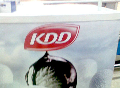
While shopping at a local Co-op, Patrick from ProjektCyan spotted what looks like the new KDD logo. It looks better and cleaner than their previous one but not sure the leaf shape is working with the typography. [Link]
 2:48AM - Entertaining Kuwait since 2003
While shopping at a local Co-op, Patrick from ProjektCyan spotted what looks like the new KDD logo. It looks better and cleaner than their previous one but not sure the leaf shape is working with the typography. [Link]
22 replies on “KDD new logo”
I agree with you. The shape makes it look like a soap logo instead of food.
Kdd does everything right, nothings wrong with Kdd they are the best of the best 🙂 god bless the company that puts a smile on our face each single day
I love the old cow face. Retro is always better.
Finally after 20 years ! Out with the old in with the new
change is nice ^^
they should hire a better graphic designer 🙂
me likey
Logo Crazed? Is it that serious?
Hi,
It should have pint shape.
Cheers
@Realist, I think you are refering to KDC and not KDD
hate it
Very much similar to Birds Eye logo…
Looks like Life buoy Soap LOGO !!
now take the company public please.
nooo I liked it better before!
i like it..new and modren
its their Ice cream logo, because they make ice cream in a different factory.
wow cdd id getting pretty big and large these days
KDD logo look like my blog main buttons !
ohh noesss, now im gonna stop buying their delicious chocolate milk because of this logo, oh why oh why…..
KDD is great i love their products! the logo is not bad bas enshala they dont change the taste and recipes
I think it looks ok good luck too kdd
What..! Kidding me..!
This what u get when u spend 1000 dinnar on branding… And 1000000 goes under the table..
LoooL
Kdd will never go public :>