
If you remember last month I posted about the new terrible BKME logo. Well since then I heard that the logo was done by an international agency (hard to believe) and I heard another story that it was designed by Horizon here in Kuwait (more believable). Yesterday I also got an email from someone called Jeeb, this is what he had to say about BKME and the logo:
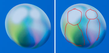
The sphere isn’t only about a pearl, a BKME personnel indicated to me that two pepole reaching each other are actualy represented inside! I said who in the world would know or see that? By the way when copied, the “pearl” or “human reaching each other” logo goes white! Vanishes..
It also took me 2 days to open an account! Still confused, I received 6 e-mails with 6 user numbers bkmeonline/e-trading, which one to use? Why the guy kept telling “use another username this one is giving an error”? Now, ofcourse, i can’t use any of them, each had a password which i don’t remember now!! Bmke didn’t reply, i have to waite till sunday. Talking about making “life simple” for us!!!
I drew with a red line what “might” be 2 guys, one seems very fat. Also I can understand about the terrible service, when I tried calling them to ask about the logo 2 weeks ago it took me all morning to get a hold of someone..
7 replies on “More on the BKME Logo”
i think it was done by one of the big mangers kid who just discover Photoshop
and something i was thinking about. how it will look like on fax?
or in black and white?
the abc of logo design it should be clear in black and white, deliver the massage fast and UNDERSTANDBLE!
sorry but i had to do it:)
this is the logo in grayscale
https://img187.echo.cx/img187/8384/logobw0ef.jpg
and this is ib black and white..
image reciving a fax with this as your logo
https://img22.echo.cx/img22/8096/logow6gz.gif
I think they were on drugs when they saw that.
they should pass around what they were smoking when they picked that crap
I saw it today, and I thought that even I could do a better job than that! I mean, it’s just a sphere with some colours on it and a lighting effect! A first-time photoshop user could fiddle around with photoshop and make the same thing! Even BETTER! Okay. I’ll start breathing now.
They Invested so much money in this new identity to just change their mind now.
It’s a disaster and I don’t see anybody giving a fuck.
yeah dude, finally I can comment. 🙂