
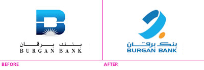
Burgan Bank today launched a new logo and personally I think it can’t get any more generic than this. I think they should have just given their old logo a face lift by simplifying the sun rays and maybe going with two tones of blue instead of the Gradient. For their typeface I would have killed the serif and gone with san serif which they actually did in the new logo. Actually the only positive thing in the new logo is their logo type but their icon on the other hand is very boring and forgettable. Not only that but where is Kuwait in the logo? Gulf Bank have the dhow, NBK have the camel, CBK have the arabesque star and now Burgan Bank have a… ribbon? Where is the locality? Where is the strength and trust? They’ve recently redone their branches into a very clean modern looking environment so why did they go with a logo that was already outdated in style before it even launched. This logo should never have left the design studio yet let alone presented to the client and gotten accepted.
What other bloggers have to say
Tatabotata: “This is the most disgusting redesign I have seen in a while.”
Patrick: “Why? But why?!”
Elsewhere
AMEINFO: “The design of the new corporate identity draws inspiration from a ring, which has been used cross-culturally for thousands of years as a symbol of partnership and commitment.”
Further Information
The logo was done by an agency in Bahrain and not LOM | FDP who were responsible for their branch redesigns
Update: The agency in Bahrain behind the redesign is Vision Communications.
58 replies on “New Burgan Bank Logo”
I prefer the B logo… another pointless logo is Bubyan bank…
what is the orange spot supposed to be? i can’t get it
well if the orange dot is a persons face and the big ribbon is the bank, it looks like the person is scared of the bank.
Another mess up to follow in the footsteps of the Zain logo (which, to my mind, is a profusion of bad colours and an opportunity wasted)
The problem for Burgan Bank is that, to most people – probably even to their own staff, the bank doesn’t stand for anything, so it’s no surprise that their new logo reflects that lack of identity and lack of meaning.
noo, but i liked the older one much more! have them change it por favor
:: Hate it
Can I sue them I just received my new ATM card and it has the old logo
Weird
It lacks class – I don’t like it at all!
I have always been thinking, why didn’t Burgan Bank modify their logo just like Gulf Bank, NBK and others did!
The new logo is just meaningless!
I think that they should have kept their B in the style of that ribbon.
Dammmit i wrote the exact same last night post but was too busy to post it today 🙁
hahahhaa, i knew ud put it up!
The B was perfectly ok. Maybe a little stylizing would’ve gotten them a better result than the their new logo.
It’s an Arabic B, with orange thing as the dot
Will non-Arabs get it? Probably not, which leads me to suspect that Burgan has no plans to become an internationally recognized bank, even though it has a Franco-American CEO
I actually think anything is an improvement on that old B.
I like it,
I too think the dot is for the arabic alphabet “ب”
This is not related to the topic, but I had to mention it as the error is repetitive and irritates me. Mark, you keep writing “yet alone”, it is actually “let alone”. Finally out of my system 🙂
lol thanks for pointing out. will fix it from now on
They actually didn’t change the fonts since the last redesign.
Check out my take on the subject.
It is a “ba”
Burgan sucks
NBK o bass
I like the font but not the ring
Its very average , that old one was awesome I don’t know why did they have to change it. Anyway although its average, its at least not ugly like mtc’s zain shit.
whats with all these bad logos.
zain,this, baskin robins,ect. the list is endless
I heard it was done by MemacOgilvy locally?
My ‘most liked’ recentish bank logo is bbk (Bank of Bahrain & Kuwait). I don’t know how it stands up from a design pov – but it was a hell of an improvement on the old one. Same goes for Commercial Bank of Qatar.
KFH FTW!!!!
someone made some serious commission on that.. i personally wouldn’t approve it unless I’m getting something.. lol
It looks like a Breast Cancer awareness logo.
It even has a nipple.
lol
The dot is supposed to symbolize that the sun has risen as you can see in the previous logo you see the sun about to rise.. the new logo is to show that they are keeping in touch with the modern times and no longer left in the dark.
Some of the comments mentioned are agreeable, one would think it belongs to a hospital rather than a bank, one can also see a soft similarity between it and Boubyan bank but in the end I find it nice since the lines are smoother now and that it’s modernistic.
Just my 0.01 cents 😛
It’s disgusting what large corporations in Kuwait are doing to their logos and identities. First Zain and now this! Why can’t they just hire professionals from 5th avenue instead of this nonsense?
As far as I can see it, it is more as logo for a bottle of water. The old one had this classy image that as soon as I see it, I would get the feeling of the classy banks with the strong reputation even if they didn’t have it.
I remember the old English ads in 99.7 calling the bank ‘BIRGIN BANK’ – now that was hilarious
i am confused … all i see three colors drawn with a cheap drawing pen
y u didn’t say anything abt the (you) campaign ? isn’t discusting 2? they waste the time the money for nothing
i like it
its a littile repetitive but the logo sux, BIG Time. It would be nicer if they spent more money on actually keeping their branches open, i remember they had just closed down a branch in salaam area during ramadan.
i guess they just do this for the money i donot believe that there was a need to change the logo. I guess their marketing department can now try and justify where the money is going where they all get their fair cuts.
Corruption!!
ZAIN is the most disgusting shit on the face of this planet. Whomever did it deserves a damn good hammering.
This thing is average at best.
The you is mentioned in the posters around Kuwait… “driven by YOU” what do you mean no one mentioned it?
That is just plane FUGLY!
hate it
i prefer the older classic B logo.
so that what they meant with all those “you” signs splattered in our face every where, what a stupid campaign
I think it is just not A class, disgusting… cheap ass 3D effect
Guys…the logo is a copycat from a Mall in Beirut… Million of KDs are wasted
Mark,
where could we see a sample of your work!
Like it ,hate it ,,,at the end of the day it’s just a logo.What will enhance it & keep it in mind of the customers is the service they get !! Good service ,,,,good logo,,, ,,s..t service….s..t logo.
The (English) font is probably the generic-est part of this totally forgettable identity. I think I had it on Windows 98 and used it for a high school project of something. Yuck. But it’s at least consistent with all the shit identities that seem to be standard in the Gulf.
Talal, the english typeface isn’t a generic windows font.
…
its not so bad imo. i keep staring at it and trying to figure out y you ppl hate it so much but i cant; its an ok logo and much better than the bulky gradient B with the white sun.
and if the new logo is actually a “ba” i find it very cool. its nice to see arabic brands or wtever try to go back to our original language.
geez. chill out.
Change is always good, even if it is cosmetic and superficial. Also, it could be argued what does it matter if you have a great livery but a lousy product i.e. customer service. Kuwait Airways is a classic case in point.
cool logo .. very nice to use arabic font 😉
The new brand for Burgan Bank employs a ring, symbolising partnership and trust as a brand essence. The symbol reflects the new attitude of the bank in aspiring to become the preferred financial partner… The ring transforms to an Arabic ‘Baa’ and the sun dot emphasises a strength of commitment to Arabic customers and to the region. The old English ‘B’ lacked geographic relevance and had very little by way of brand value standing behind it.
You guessed it. We designed it, responsible as part of a team that also created the new branches and interiors. We are an agency in Bahrain, working in association with a London based architecture firm.
We designed the new BBK identity and Commercialbank of Qatar as well.
Glad to see our work is so talked about !
Nicholas thanks for appreciating everyones opinions here.
Out of the three banks you mentioned I would have to say my favorite is the BBK identity. I’ve already posted about it before:
https://248am.com/mark/kuwait/bbk-new-identity/
https://248am.com/mark/design/bbk-logo/
looking at the logo again, it looks like the B letter in arabic.
the ugly campaign is doneby Memac
Well, the new logo of burgan bank is B but in arabic. i know it sound silly
but take a close look & u will se it`s baa`a.
So, four years on, how does everyone feel about the Burgan Bank logo now?