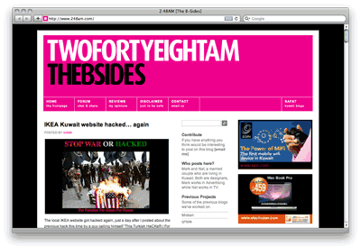
Welcome to the new and improved site. I know it still looks the same and some of you might not even have noticed a difference but that’s because I wasn’t interested in a complete revamp. The blog has become very recognizable with the bright magenta on top and black background, changing it would be like Coca-Cola suddenly going blue. What I did with this redesign is improve on the old design and fix things that needed to be fixed.
Firstly the biggest change is that the site now looks exactly the same on any browser on any OS. Previously it looked slightly different depending on what browser on what OS you were using. The only difference now is for some reason on FireFox on a Mac the titles on the tabs under the header are in bold. But that’s it everything else looks the same. I’ve widened the site but not by a lot so that if you’re viewing the blog from a netbook you don’t need to scroll left or right to see the whole width of the page. It fits perfectly.
Secondly the ads. The most important change is that there is no longer an ad on top of the posts. I’ve decided not to put an ad there and have instead kept all the ads on the far right. This way I’ve created a clear and distinct line between what is an ad and what isn’t. Everything on the left is me, it’s my space and I say what I want. Everything on the right is paid for. I’ve changed the shape of the ads and made them slightly smaller so they look a lot neater now. I’ve also had all the advertisers reduce the physical size of the ads by half so that the site loads even faster now then it previously did.

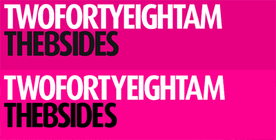
I’ve also changed the color of the header slightly and made it a 100% magenta which is slightly brighter than the previous header. I then changed all the other magenta on the blog to match, so all the links and buttons etc.. are now slightly brighter. Oh and when you hover over the tabs under the header, the button now turns white instead of black. Looks cleaner this way.
I’ve really done a ton of minor changes here and there. For example the titles of the posts are now 100% black instead of dark gray, the comments under the posts look A LOT neater now and I’ve also removed the number next to peoples comments. There was a bad habit previously in which people replied to each other by post number. For example “I have to agree with post 23, Britney Spears is hot”. Now people will have to refer to each other by name or nickname. Another issue with the comment numbers was that if there was a comment in moderation before post 23 and I approved it after someone responded to post 23 then post 23 would suddenly become post 24 and the person who commented in reply to post 23 would look stupid.
Oh another important change, I’ve removed the tab on top called “Archive” which used to contain all my post categories and have instead listed all my categories on the side. Those of you who’ve been visiting my blog for a few years now will realize that’s how it used to be before my previous redesign. I find it a lot more useful having it in the sidebar and I am hoping it will encourage more people to dig into my blog and engage with my older posts. I’ve posted soo many things over the years and a lot of them are still interesting to this day so its worth making them available. I’ve also shifted the “Site Tools” up because I feel my twitter and facebook group are worth visiting and so need to be highlighted more. I’ve moved the other bloggers list to the bottom of the side bar so that way the more interesting blogs I find the more I will be able to fit. The side bar used to also have a gray background which I removed, makes things a lot more airy and less suffocating.
So in conclusion, the blog loads faster, looks neater and is just an improved version of the previous design.

37 replies on “It tastes better”
love it ! so neat
perfect design
H A A P Y N E W Y E A R
Nice mark, good thing removing the gray background on the right bar. Looks much better now!
Happy new year.
neat upgrade indeed
I must get used to no Numbers it take some of the look :\
but it look neater indeed 😀
Congrats =P
like it
All good changes, Mark. Great result.
Happy New Year to you and Nat.
Nice touches…looks better now that the ads r more organized.
i am glad you stuck to the theme. Its unique identity. Thanks for removing the top advt. Looks lot better on mobile devices too.
looks good!
this area looks particularly neat! mabrook!
i’m loving the new design,
waaaay neater and faster to find everything
also i noticed that pages are loading faster as well
2 thumbs up 🙂
Sweet. I’m guessing the forum will be updated too?
Hey ! seems like it is only me who did not change or improve his site ! hehe
and yes it is faster 🙂
Congratulations ! 🙂
the site is very neat now
another minor change i have noticed is when the site is loaded in chrome, the tab used to show a 2:48am icon in magenta. now its is just magenta, with no text in it.
overall the arrangement of the ads is by far the best thing changed.
kutgw
great stuff…perhaps your links could come up on a pop up instead?
new design is great. it actually loads much faster.
Did you intentionally change the favicon?
In Firefox it’s now just a solid magenta square, with no white centre.
at least RSS feeds provide more info 😉
happy new year
ramo: pop up links are annoying
Ben: yeah, its just a solid magenta box
Khaled: thats temporary for a side project i am working on
ozy: i have two things i am working on and one of them is the forum
keep it, and you can add ads in the RSS feed, I wouldn’t mind.
off topic: I heard Zain Kuwait is selling the MiFi, do you know anyone who tried it ?
i don’t want to put ads in RSS. i just think rss readers strip a lot of atmosphere from the blog and turns it into something very soulless.
love the way the comments are now!
MARK, maybe u should stick with the older majenta colour that was far more better
great work .. love everything! 😀
Lots of nice changes and I’m glad it loads so much faster now! Things look nice and neat and I’d like to say Congrats 🙂
And Happy New Year to both you and Nat 🙂
Hey…Great updates…
just a thing i noticed, when i move the cursor over the HOME, FORUM tabs, it changes the explanation to black and the title gets hidden…
is that how its supposed 2 b?
HAPPY NEW YEAR!!
I like the ads better now….no clutter, clean
Review please:
https://www.q8path.com/reviews/fresh-year-with-new-design/
musty, no it shouldn’t. what browser are you using and what OS?
hi…am using IE 8 and Windows XP.
have uploaded a snapshot for u 2 see…
https://www.flickr.com/photos/46136323@N02/4236864904/
can you do a hard refresh and try again
I like the entire theme of the site- the pink colour especially. It help keeps things consistent.
Even your photos have a backdrop of pink. Like that toy helicopter post, posted quite recently.
Keep blogging!
I agree! it is very neat, in order… and much better..
Happy New Year to you & Nat! =)
works fine now….
Needs more cowbell.