
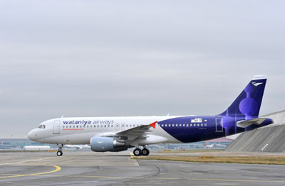
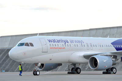
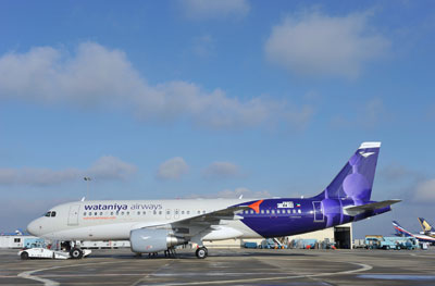
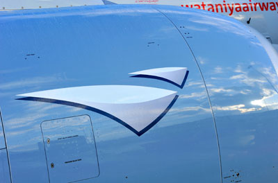
Some Contrast posted some pictures of the plane a couple of days ago but I couldn’t until I got approval from Wataniya Airways since they are my client. The above and below are pictures of the plane parked in Toulouse, France where Airbus plant is located. Hopefully next month I am going to be in Toulouse for the official unveiling and take some of my own photos but for now here are some of the photos taken by Airbus. The Kuwait Towers are proudly displayed on the tail of the plane and I think it actually looks pretty good. Definitely much better than the new MEA design which I HATE.


29 replies on “Pictures of the Wataniya Airways plane”
yeah i saw it yesterday, i really like the colors, i can see kuwait towers, But I can’t see the resturant ;p
Beautiful. Really stands out.
I really liked the new MEA.. much better than the pre-historic ones they had before..
very tastefully done, I especially like the logo.
I don’t know…
There’s something about it that i don’t like
Mark, what do you think about the new egyptair logo?
Google it.. It’s kinda nice but.. i don’t know!?
https://aviationbrandingweblog.liladesign.com/#post37
There you go
Did you see it when you were in Cairo recently?
yeah i recived them today 2 ..
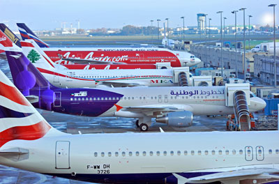
its even better looks than the british airways which is next to it in the picture .
very proud with the kuwait towers in the tail .. this means alot in international airports .
Bavud: check this
https://248am.com/images/newegypt.jpg
i shot it at the airport when i was shooting there.
i like the tail of the plane, kinda looks retro but i dont like how they just repeated the logo on the front again, i think they could have done more with the blue stripes.
I think it looks cheesy and really stupid! wtf?! the towers look like shit first of all based on how they are rendered and what’s up with the purple? AND DON’T GET ME STARTED ON THE LOGO! A PAPER AIRPLANE?!?!?! seriously WTF!!!
it looks great stop being so jealous of kuwait haters
eygptair logo is kinda scary :/
liliuokalani their logo is not a paper plane..
OH my god there so stupid, didn’t they study airplanes?!?!
don’t they now that exta paint on the airplane would make the airplane heavier and that would cause the precentage of it falling rise.
“Definitely much better than the new MEA design which I HATE”
Is it because u did not design it, or because they are not your client?
dont like it, and dont like the street adds
Adrenaline mark didn’t design the planes, P&G Dubai did.
I like its colors [I think it is more catchy to the eye]. But I barely noticed the LOGO in the tail!
i wanna ride it on its first flight to Dubai … i wish :>
“The Kuwait Towers are proudly displayed on the tail of the plane and I think it actually looks pretty good. Definitely much better than the new MEA design which I HATE.”
Can you say other than that since they are your clients Mark?
The MEA is also proudly displaying their Lebanese Flag and the Ceder is proudly standing up and I think it is wonderful.
Its a matter of taste and a bit of compliments.
i gotta agree with “madonps” Mark, what on earth so special or creative about the wataniya logo, u stuck Kuwait’s most abused icon “kuwait towers” and painted it blue and stuck it on the tale, u might as well put the camel and call it game! The least is play around with the towers in some artistic way.
But then again the main brief from the so not smart client missed the core selling point and stand which should be their objective since the logo is what will reside in the consumers head!
the whole campaign in general missed the point, what does national achievements identity or historical events got anything to do with airline business, not to mention whether we like it or not we have Kuwait Airways which is Kuwait 1st national achievement and then the 1st private novelty goes to Jazeera! so what’s so national and original about this airlines, the air hostesses are Kuwaitis and they comply with the “takweet”?. Is that all what Wataniya airways stand for, but so does Salmiya coop! So what’s the difference?
Till today, their communications have failed to connect its point of distinction and benefits to the clients, rather it was a nice awareness campaign providing the consumer with a free fact sheet about Kuwait, which honestly was beneficial and interesting to know. they should have saved it for national and liberation day, would make more sense.
Another failure of the advertising industry in this country.
HeartBeat I probably can’t say the plane looks ugly (actually I can if I want to since we didn’t design it) but if I didn’t like it I could have not given my opinion. Some of you need to understand that no one tells me what to say and I am not forced to say anything. Sometimes its true I can’t say negative stuff about a certain company because they are my clients but I would never say something good because I am obliged to.
The MEA proudly displays the Cedar on the tail true but the plane looks like shit and I hate the MEA logo. If you click the link below
https://248am.com/forum/viewtopic.php?f=1&t=6018
you can see that the reason I don’t like the new MEA logo or plane is because I love their older one.
And yes it is a matter of taste.
And in case you missed it here is the picture of the MEA plane, you can’t tell me that looks good
https://photos-a.ak.facebook.com/photos-ak-sf2p/v189/152/34/782965033/n782965033_2596440_5235.jpg
im serious: madonps was being sarcastic with the idea they shouldn’t have painted the planes to save fuel thing so I dont see what exactly you’re agreeing with him on.
In any case the launch campaign is meant to introduce the airline to Kuwaiti people and position it.
Kuwait Airways true was a Kuwaiti achievement but we’re talking ages ago here.
Jazeera Airways is also an incredible airline which I personally use very often.
But, Wataniya Airways on the other hand is everything Kuwait Airways should have been today but isn’t. It’s an airline thats supposed to inject pride into the Kuwaiti people and thats why everything about Wataniya Airways goes around doing that starting with the name “Wataniya” to their symbol the “Kuwait Towers” to their launch campaign “Kuwaiti achievements”.
Yes the Kuwait Towers is abused but thats because it represents Kuwait the same way the Eiffel Tower represents France and the Statue of Liberty represents the US.
I hope my explanation makes things clearer, this airline is a good thing for Kuwait and personally when I found out about the airline I was like “finally!”.
Even though I am not a Kuwaiti, I’ve lived all my life in Kuwait and my mum was a flight attendant on Kuwait Airways back in the early 70’s
https://248am.com/mark/interesting/kuwait-airways-vintage-photos/
so for me it was very frustrating to see how Kuwait Airways was so ahead of everything else in the Gulf back in the day and to see it now behind everything else. I understood why UAE had a better airline than us but I couldn’t accept the fact that Qatar and Bahrain also had better airlines than us. This is why I was excited to pitch for this account and this is why I work on this account with a lot of passion.
To tell you the truth looking at it now I am actually a very lucky guy because my clients are NBK, Zain and Wataniya Airways. I actually wake up every morning to come in and work with my favorite Kuwaiti brands. You can’t get better than that, actually you can if you add KDD into the mix but maybe I should set that as a future objective. I should also get Shani, Sunkist and Kids ‘R’ Us as clients lol
“Shani, Sunkist and Kids ‘R’ Us as clients” Lol !
wouldn’t that be great ?
I can’t get Kids ‘R’ Us out of my head, someone out there must have pictures of their branches from inside or something. I need to post something about this and ask people to send me any picture of Kids R Us they have.
I like the idea of Wataniya Airways much more than Jazeera Airways which does not have any refund policy (this called enrichment without any consideration – a steal in other words – especially when you are paying the same fees as a regular not low-fare airways).
By the way, the colors are nice, but the towers on the tail suck especially when they added their own logo above, I would have preferred their logo magnified and covering the whole tail because we all know that the logo itself is also the Kuwait’s symbol (the boom’s sails probably suggested from F. Alghanim Logo)
Amazing color, the plane stands out among the others.
Maybe I’m being totally ignorant here, but what exactly do you do Mark? As in your full time job? Just interested is all.. Cuz it seems like a pretty kick ass job if you get to work with designing planes, or advertising them or what not.
The towers in the tail is fine but I am not sure that the image and logo is Recognizable for a stranger eye who did not saw the actual towers