Found this really cool graphic novel for the PSP. Issue 1 is already out and Issue 2 should be coming out this month. [Link]
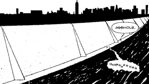
 2:48AM - Entertaining Kuwait since 2003
Found this really cool graphic novel for the PSP. Issue 1 is already out and Issue 2 should be coming out this month. [Link]
I.D. has the results of the 2005 Annual Design Review, America’s largest and most prestigious juried design competition. The categories of this year’s best designs are: consumer products, graphics, packaging, environments, furniture, equipment, concepts and interactive. To see the winners click here.

This is such a cool idea, the BBDO ad agency proposed to protrude fake arms and legs the trunks of taxicabs — right next to bumper stickers hyping the new season of the HBO megahit The Sopranos. HBO though refused to run this promotion but are now considering it to hawk the show’s sixth season. [via]
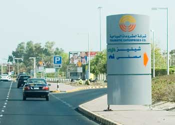
Has anyone noticed these signs on the sea side? They are huge, bulky, ugly and unpractical. They are hard to read, its only in Arabic, and the most important information which is the logos of the restaurants are too tiny to be noticed. I am also sure its impossible to read the sign at night. Who is responsible for approving this crap? I am guessing its the same people who authorized the construction of a tall building to block the Scientific Center.
It really does… [Link]
This site has intro titles to movies designed by Saul Bass. Saul Bass is a very famous graphic designer who’s worked with some of Hollywoods greatest film makers including Alfred Hitchcock and Stanley Kubrick. This website has an interactive gallery which displays the movie intros which Bass designed, some really really cool stuff. [Link]
[via]
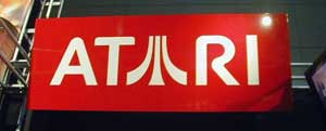
Another interesting article but this one is on the Atari logo and how it evolved through time. The writer also puts a lot of focus on Atari’s fuji symbol and how a lot of variations of it exist. [Link]
As I predicted, Freehand has died. Good riddance to bad rubbish. [Link]
1. Ignore everybody.
2. The idea doesn’t have to be big. It just has to change the world.
3. Put the hours in.
4. If your biz plan depends on you suddenly being “discovered” by some big shot, your plan will probably fail.
5. You are responsible for your own experience.
6. Everyone is born creative; everyone is given a box of crayons in kindergarten.
7. Keep your day job.
8. Companies that squelch creativity can no longer compete with companies that champion creativity.
9. Everybody has their own private Mount Everest they were put on this earth to climb.
10. The more talented somebody is, the less they need the props.
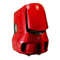 I saw this computer case today at the ASUS dealer and it sooo wanted me to get a PC. It looks really cool and aerodynamic plus it comes in 3 funky colors.
The case is called the Vento 3600 and its available on Amazon for only $149. At the dealer in Kuwait it costs KD100! And I thought only Mac dealers in Kuwait were expensive… [Link]
Asus Dealer Kuwait: 2477101 or 2477102

Palm got split into 2 companies a while back, Palm Source and Palm One. Palm Source was going to be the software company and Palm One the hardware. Now, Palm One has become Palm again, and they have rebranded starting with a new logo. [Link]

A couple of days ago I posted a link with the past logos of the Olympics, today I am posting about the Beijing 2008 logo, the upcoming Olympic games that will be held in China.
According to some sources, the following it the meaning behind the Beijing 2008 logo:
The official emblem of Beijing 2008 entitled “Chinese Seal-Dancing Beijing” cleverly combines the Chinese seal and the art of calligraphy with sporting features, transforming the elements into a human figure running forward and embracing triumph. The figure resembles the Chinese character “Jing”, which stands for the name of the host city and represents a particularly significant Chinese style. The artwork embodies four messages:
– Chinese culture,
– the color of red China
– Beijing welcomes friends from all over the world
– to challenge the extreme and achieve the perfect and promote the Olympic motto of “Citius, Altius, Fortius (Faster, Higher, Stronger).
I personally don’t like the logo because I prefer the one below. Its the one Beijing used when they were bidding for the Olympics. But according to officials, “to safeguard the interests of the Olympic sponsors, it had to have a new one.” I don’t know what that means but they basically had to create a new logo which is the one they are using now.

Here is more information on the new logo
Here is more information on the old logo
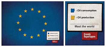
The magazine Grande Reportagem in Lisbon, Portugal, is running a sobering ad campaign that adds a color-coded legend to the flags of various countries to comment on the cultural and social conditions there. The mastermind behind the effort is a 25-year-old Brazilian graphic designer named Icaro Doria. “We started to research relevant, global and current facts and thus came up with the idea to put new meanings to the colors of the flags,” Doria tells BrazilianArtists.net. “We used real data taken from the Web sites of Amnesty International and the UNO.” The tagline is, “Meet the world.” The campaign, via Foote Cone & Belding Portugal, won a gold Lion at Cannes. [Link]

Here is a link to all the past Olympics logos. I think the 1972 Munich one is very trippy but my favorite is Mexico from 1968. [Link]
Finally a test I won in.. I scored 10/10! [Link]
Note: “Rip-off” gave me the most trouble.