Yourlogomakesmebarf.com is a website that collects crappy logos. The one above is currently my favorite. [Link]
 2:48AM - Entertaining Kuwait since 2003
Yourlogomakesmebarf.com is a website that collects crappy logos. The one above is currently my favorite. [Link]
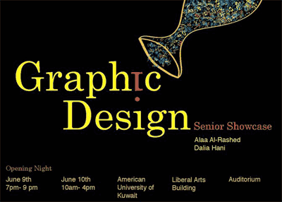
The American University of Kuwait will be holding a Graphic Design showcase on June 9th from 7pm to 9pm and on June 10th from 10am to 4pm.
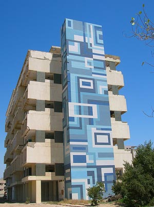
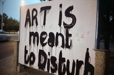
The building above looks like its getting demolished which sucks. What would be the harm in refurbishing it? I think the blue pattern is really funky. [Link]
Picture taken by Italian in Q8

I noticed today that the Kuwait National Petroleum Co. (KNPC) office in Kuwait City got re-branded to SOOR Fuel Marketing Company. So I guess this means their gas stations will also soon be re-branded to SOOR. Personally, I don’t like their new identity but at least they have a logo unlike their competitor Oula. [Link]
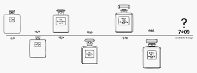
I just got invited to a new exhibition that will be held at the Al Sabah Art & Design Collection next week. For this exhibition they commissioned a bunch of designers and artists to customize a very popular fragrance bottle which they will be displaying and selling at the exhibition. They aren’t revealing what the fragrance is until the actual event but I heard that the fragrance might actually be Chanel No.5 which could be what the “5.5” in the exhibition title stands for. H
Private Viewing / April 12, 2009 (By invitation only)
8:00pm to 10:00pm
Open to Public / April 13 to April 20, 2009
10:00 am to 10:00 pm
Admission: Free
Here is the link to the actual invitation which contains more information. [Invitation]
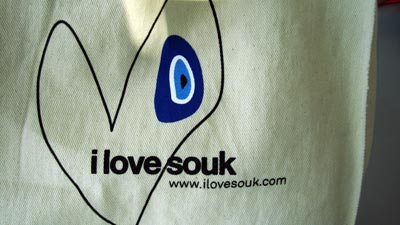
Yesterday I passed by a new concept store which my friend set up called i love souk. It turned out to be a pretty cool store that sells a bunch of random funky items like design books, vintage clothing, accessories, artwork and more. They’re also authorized dealers for Lomography and American Apparel.
They’re located outside Al Corniche Club to the left of Athletes Foot right on top of the Al Sabah Art & Design gallery. Their main ilovesouk.com website is still not up but there is a small section with pictures about the store on the Al Sabah Collection website which you can check [Here]
I first spotted this on Some Contrast and then this weekend I ended up driving by it on the way to Marzouqs place so I decided to stop and take a picture of it with my Yashica. If you want to see the previous artwork that was on display there click [Here]
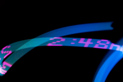
Found out about this app from Gizmodo and paid $1 to buy it from the iTunes store hoping to do a cool 2:48AM thing with it. It didn’t work as expected or should I say I ran out of patience after playing with it for like 10 minutes.
The way the app works is you type out your message on the phone, choose the color of the text and then if you wave it in front of your camera the app should be able to write out the message. The fact I tried to do this shooting and waving thing alone probably didn’t help so if you want to try this out make sure you’ve got a friend with you.
Here is a link to Light Writer in the iTunes store. [Link]
Someone emailed me about an exhibition thats taking place in Kuwait for a “digital artist” called Anwar Ghader. So I googled him to check out his work when I found a cool post on Projekt Cyan showing how in under 10 minutes you can replicate one of his work. I really dislike how some people take a picture, apply a few Photoshop filters and then call it art. That’s not art, what I posted the other day is art. So if you want to find out how to create your own digital art like Anwar click [Here]
Update: Just so there is no miscommunication. The reason I don’t call Anwar’s work art is not because it was easy to create or because it is ugly or anything of that sort. Its because of the way the work was created. If I take an image and using the software Rasterbator I create something nice, does that make me an artist? If I use Obama Icon Me to create a cool looking poster, does that make me an artist? So why is it art when Anwar (or any other person) uses live trace to create the work?
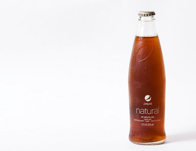
I love the bottle! [Link]
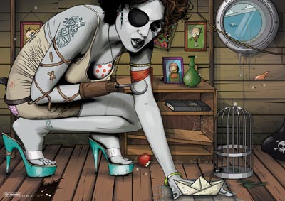
A reader yesterday emailed me a link to a website of a Kuwaiti illustrator called Ahmed Al-Refaie. I checked out his work and was blown away so I emailed Ahmed and asking him if he could tell us a bit about himself and his illustrations and this is what he had to say:
Currently, Im about to graduate from Kuwait University “English Literature”. I don’t like it, but certain circumstances forced me to since there was no Graphic Design in KU. My name is Ahmed Al-Refaie (22) (Kuwaiti, although that does not matter, an artist is an artist no matter the origin ), my art is called vector art. I’m self-taught, never attended any art related classes. When I was 10, I started sketching, beginning of high-school I began graphic design, but this current style you see all around my website started in early 2006. Usually my art was varied in style and that is what I think of as a corrupted aspect of an artist. So I made and refined my own style. My website does not include my old works. For more technical details, I use a mouse, keyboard and Photoshop CS3 ( I always get the question “do you use a tablet?” ), just a good ol’ Apple mighty mouse. I was a bit into 3D using 3D Max but quickly lost interest as there are many giants in that field, its just not for me. That said, my work is completely raw, no pictures, filters, I do however reference body gestures (sometimes) but the image used is removed and I recreate the whole thing.
I think the guy is extremely talented and I think its about time KU setup a design department. There are a lot of talented young people and it would be sad to see them all taking random majors like English Literature or cooking just because they don’t have design.
Here is a link to his deviantART gallery [Link]
Here is a link to his personal website [Link]
There is a digital art showcase that’s being held at The Exhibition for the next two days. Here is the information I received by email:
Ugly, But Beautiful
Date: February 26-28
Time: 4PM-12AM
Location: The ExhibitionBeauty is something rational, everyone has their own taste of it. Ugliness, on the other hand, is one’s own opinion.
When you look at an image that is full of beauty and structure, you find it beautiful because you are living a structured life. You rarely see things placed randomly, as a result you say an image is ugly without knowing that ugliness has its own beauty.
That is why we can say something is ugly, but beautiful at the same time.
‘Ugly, But Beautiful’ is Remon Yousef’s means of making you see how ugliness can have its own beauty.
Remon Yousef, a Lebanese graphic designer currently working in Kuwait, will be showcasing his artwork to the public for three days only.
All artworks are for sale.

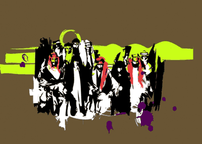
Abdullah, a reader of the blog sent me a picture of the giant wall sticker above which he took while he was in the States. The reason he sent it to me is because it looked very similar to Kuwait’s national logo (also pictured above). I wonder if a Kuwaiti living in the States remixed the logo or if Shepard Fairey (the guy behind OBEY) did it himself. He already admitted that his famous Obama Hope poster was based on a copyrighted photograph so it wouldn’t be to far fetched to think that he based this design on the Kuwaiti national logo. For those of you who don’t know anything about OBEY or Shepard Fairey, check this [Link]

I sooo want these sneakers! Only 130 pairs of these lucky-red sneakers were made and I desperately want one. I love the embroidered graphics in the red silk texture and the box with the different compartments for the different shoe laces it comes with is really cool.

I found my size on eBay but its selling for KD288! I wouldn’t mind paying that much if the sneakers somehow magically didn’t get old or dirty. But to pay that much and watch dirt and grime cover them… Check out this link for a lot more details and more pictures of the sneakers. [Link]
