
I can’t get enough of this. [Link]
 2:48AM - Entertaining Kuwait since 2003
I can’t get enough of this. [Link]
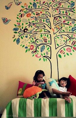
Back in 2006 I posted about a blog called IKEA Hacker that had just launched. The blog displayed different IKEA hacks done by other people, people who took regular IKEA stuff and using their creativity turned them into unique pieces. Well two of those people are a couple living in Kuwait, Pinot and Dita. They took IKEA fabrics, cut them up and then created fantastic wall art with them. Its really cool stuff and whats even more cool is the fact they taped the whole thing and created a video presentation which you can watch below. Currently they’re voting for the IKEA hack of 2008 and they are nominated so vote for them by clicking [Here]
Now watch the video below of the making of and check out the post about them on IKEA hacker. [Link]
[YouTube]
Interesting fact, did you know that the Kuwait National Assembly was designed by the internationally known architect of the Sydney Opera House, Jørn Utzon? Jørn Utzon sadly passed away late last month on November 29th at the age of 90.
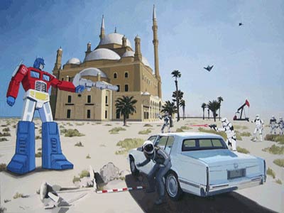
I am nearly done redecorating my house so I’ve started looking for accessories including paintings. Like everything else in my life I am looking for them online since I highly doubt I could find anything interesting here. One painter that’s recently grabbed my attention is Scot Listfield. He mostly paints astronauts, the future and even Star Wars characters like in the painting above which by the way is amazing but already sold! I emailed him asking about the price of two other paintings I found interesting, one is called McDonald’s the other Intelligent Design. If you notice both have something to do with burgers! Anyway check out his work he has some pretty cool paintings if you’re into this stuff. [Link]

I love the new look, always preferred Pepsi over Coke and now I have one more reason why. The video below is what Pepsi sent out to 25 influential people but if you want to simple take a look at the new logo and bottle designs click [Here]
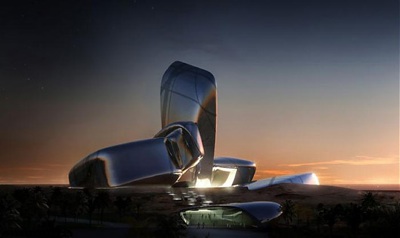
This rendering is of the new Center for Knowledge and Culture in Saudi Arabia. It still hasn’t built but the design just got approved and it looks like something from the future. Hovering cars wouldn’t look out of place in this shot. [Link]
via BoingBoing

This is by far the coolest looking reusable water bottle I have seen. It goes on sale next month for $30. [Link]

This is a link to a blog post that contains 70 different business card designs. A lot of nice looking cards, my favorites are the interactive ones like the one pictured above. [Link]

A really cool photo set of soda bottles, cans and logos dating from the 60s through to the 80s. Coca Cola launched their classic bottle awhile back but someone should tell 7up to do the same thing. Their can design pictured above from the 70s is extremely funky. [Link]
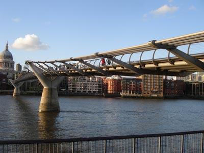
After finishing work today I decided to walk along the river past the London Eye. I actually thought I was walking back to the hotel but only after around an hour walk did I realize I was actually heading the wrong way. As I was about to turn back I noticed an interesting looking bridge in the distance. Turned out it was the Millennium Bridge which I had seen in pictures before. Its a pedestrian bridge that stretches out across the River Thames and it looks really futuristic because of its low profile. I took the picture above before I got on the bridge and the one below from the bridge.

Here are links to better pictures I found on Flickr.
Picture 1
Picture 2
Picture 3
Picture 4

These are some seriously funky Reeboks designed by John Maeda for women. They go on sale on March 31st and only 100 pairs will be available. They will only be available on the RBKcustom website. [Link]
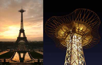
For the Eiffel Tower’s upcoming 120th Anniversary, a new extended observation tower will be added to the top floor. It seems a design competition was held a while back and the architecture group Serero won with the design above. I think it looks pretty cool, very futuristic and alien like. [Link]
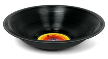
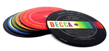
Records recycled into bowls and coasters, I imagine the bowl is pretty fragile but still looks pretty awesome. [The Bowl] and [The Coasters]
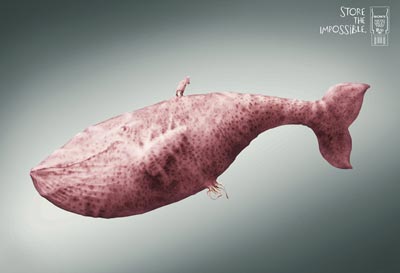

My favorite advertising campaign this year and best of all, it was produced in our region.
Advertising Agency: Promoseven, Dubai, UAE
Creative Director / Copywriter: Ali Ali
Art Director: George Azmy
Illustrator/3D: Furia

I found this lamp at Sultan Center and its called LivingColors by Philips. The lamp can project light in over 16 million different colors in which you can control by a color wheel on a remote control. It looks really cool but I am still trying to figure out if its worth KD64. You can try it out at Sultan Center, they have a live one on display for you to play with. More information available on the Philips website. [Link]
Here is also a YouTube video of the light in action. [YouTube]