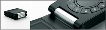
What the fuck happened to B&O?? This has to be the ugliest and least practical item designed by them ever. Its fugly! [Link]
 2:48AM - Entertaining Kuwait since 2003
What the fuck happened to B&O?? This has to be the ugliest and least practical item designed by them ever. Its fugly! [Link]

A nice collection of Motel Signs from various parts of the US. I always wanted to stay at a Motel for some reason but I never got the chance, I guess since you see it so much in the movies and we really don’t have any similar places in Kuwait it becomes like something you can’t have which makes you want it more. [Link]
The Design Encyclopedia is a growing, collaborative resource that describes, tracks and explains culture, commerce, politics, media, sports, brands – everything possible, really – through design. [Link]
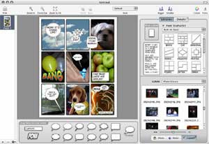
This is a cool mac app I just downloaded. The application is called Comic Life and allows you to easily create comics using your pictures and text. Its VERY EASY to use and has numerous options for a variety of layouts and balloons. I was easily able to create a stupid but really cool looking comic in like less then a minute since it automatically loaded up my iPhoto pictures automatically in the sidebar and allowed me to just drag and drop images into the layout. You can download it and try it and its only 4MB. [Link]
I am currently updating the website’s theme slightly. If things look a bit off its because its not final yet.
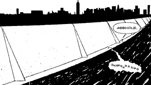
Found this really cool graphic novel for the PSP. Issue 1 is already out and Issue 2 should be coming out this month. [Link]
I.D. has the results of the 2005 Annual Design Review, America’s largest and most prestigious juried design competition. The categories of this year’s best designs are: consumer products, graphics, packaging, environments, furniture, equipment, concepts and interactive. To see the winners click here.

This is such a cool idea, the BBDO ad agency proposed to protrude fake arms and legs the trunks of taxicabs — right next to bumper stickers hyping the new season of the HBO megahit The Sopranos. HBO though refused to run this promotion but are now considering it to hawk the show’s sixth season. [via]

Has anyone noticed these signs on the sea side? They are huge, bulky, ugly and unpractical. They are hard to read, its only in Arabic, and the most important information which is the logos of the restaurants are too tiny to be noticed. I am also sure its impossible to read the sign at night. Who is responsible for approving this crap? I am guessing its the same people who authorized the construction of a tall building to block the Scientific Center.
It really does… [Link]
This site has intro titles to movies designed by Saul Bass. Saul Bass is a very famous graphic designer who’s worked with some of Hollywoods greatest film makers including Alfred Hitchcock and Stanley Kubrick. This website has an interactive gallery which displays the movie intros which Bass designed, some really really cool stuff. [Link]
[via]
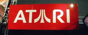
Another interesting article but this one is on the Atari logo and how it evolved through time. The writer also puts a lot of focus on Atari’s fuji symbol and how a lot of variations of it exist. [Link]
As I predicted, Freehand has died. Good riddance to bad rubbish. [Link]
1. Ignore everybody.
2. The idea doesn’t have to be big. It just has to change the world.
3. Put the hours in.
4. If your biz plan depends on you suddenly being “discovered” by some big shot, your plan will probably fail.
5. You are responsible for your own experience.
6. Everyone is born creative; everyone is given a box of crayons in kindergarten.
7. Keep your day job.
8. Companies that squelch creativity can no longer compete with companies that champion creativity.
9. Everybody has their own private Mount Everest they were put on this earth to climb.
10. The more talented somebody is, the less they need the props.