
Everyone is blasting this song in the office. [MP3 3.1MB]
Category: Design
Categories
Hotel Puerta America Madrid
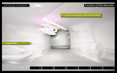
My friend is going to Madrid soon and he was checking out hotels when he found this one. Every floor is designed by a different designer and is a completely different style and mood then the other. My favorite is is the Zaha Hadid floor, looks like something off an alien spaceship. [Link]
Categories
The Rasterbator

The Rasterbator creates huge images from any picture. Upload an image, print the resulting multi-page pdf file and assemble the pages into an extremely cool looking poster up to 20 meters in size. [Link]
Some really bad stuff, my favorite is number 4. [Link]
Categories
Choowy Goowy New Look
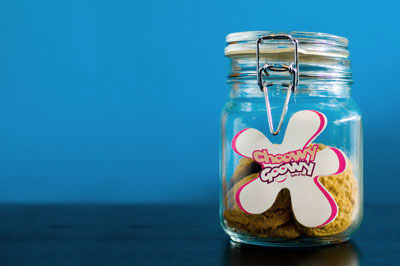
Choowy Goowy have just launched a new look. They’ve redesigned the labels and have also added more flavors including one flavor called “Mark&Nat” which is the oreo cookies. Finally and probably the biggest addition is that they also have brownies. For more information call 2626559.
update: The jar in the picture above is the Solo flavor and not the Mark&Nat one, below is the Mark&Nat label, its 100% Magenta same as the blog.

Categories
Dairy Queen
![]()
Dairy Queen have changed their logo for some strange reason. The new logo is basically similar to the old one with the biggest difference being the addition of two swishes. I think the old logo was much nicer, I see absolutely no need for the swishes, it makes it look tacky. [Link]

I don’t know much about this movie but I like the promotional poster for it. [Link]
Categories
The Wall
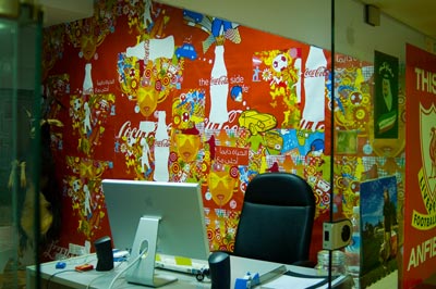
Me and my partner at work plastered over 20 Coca Cola posters on our room’s wall. We wanted to add a bit of color to the room and we figured this was the coolest way. I am a Pepsi guy though.
Categories
Nats new toy
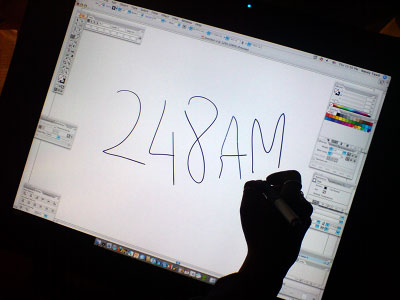
Nat came in to work today morning to find a new toy awaiting her. Other then her 30inch Apple display, Quad Core Mac and 8GB of RAM, she now has a 21 inch Cintiq 21UX tablet!
Categories
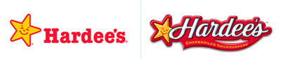
Hardees Rebrands
Categories
Aero Redesign

I was at Sultan Center and noticed Aero redesigned their package and logo. It now looks a lot cooler then before. I love the new typeface.
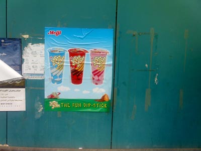
Looks like Yan Yan have a guerrilla campaign going on. Ok maybe not. Its only one poster I saw on a wall outside a supermarket but still its a pretty cool poster. The best part is the tag line which is “The Fun Dip-Stick” (closer look).
Here are two definitions of Dip-Stick taken from UrbanDictionary.com all though I know it simply as another word for idiot:
1. Dip Stick
One who’s brain capacity is less than a long thin piece of metal used to check oil levels.2. Dip Stick
The usage of fingers during sexual activities to gage the moistness of a woman’s vagina.
Now thats pretty cool.
My favorites are Little Miss Sunshine and Brick.. which is a good movie by the way. [Link]