
I was going to post about this for awhile now but never got around to it. Doesn’t matter though, Brand New has a write up about PWC’s rebranding into Agility. It was done by Siegel+Gale and I heard it cost them 1.5 million dollars. [Link]
 2:48AM - Entertaining Kuwait since 2003
Just found out about this new blog by 3baid called the Kuwait Paper Dump. The idea behind the site is to create a sort of archive for all the paper leaflets, brochures and take-away menus you find on your doorstep or on your car windshield for example. It would have been cooler if he set it up on WordPress since then we could search through the leaflets using tags or a search engine. [Link]

One of the few logo revamps lately that I actually like. [Link]
A very easy how-to on giving your resume a facelift using Microsoft Word. When I get a crappy generic looking résumé printed on a 10 year old ink jet printer I usually don’t bother looking at it. But, when I get one thats laid out nicely I always end up reading it. [Link]

Wow, if I had the free time I would definitely attempt making this. I don’t think I have ever seen a cooler Halloween pumpkin. [Link]
This is very sad news, Alan Fletcher an incredibly talented Graphic Designer passed away on the 21st of September. I can’t believe this news wasn’t more publicized. Alan Fletcher was a founding member of the design agency Pentagram and is among the most influential figures in British graphic design history. I posted about him previously when I wrote about the Commercial Bank of Kuwait logo. This is really really sad news. If you never read my post on the CBK logo then you should since there is a very nice piece written by Alan Fletcher where he talks about his experience coming to Kuwait and the idea behind the logo. I can’t believe he is dead! [Link]

My favorite publisher is Phaidon, their books are of extremely high standard and their design and typography is unmatched. I just found out they are publishing the Wallpaper* City Guides and I really want to have the full collection. Sadly the first guide I want is for Montreal but that comes out October 2007 so the first city guide I will have to get is Amsterdam. One guide sells for $8.95 but you can buy the first set of 20 for $143 which isn’t bad at all. [Link]
Qualitynet have redesigned their site. I tried accessing it earlier with just qualitynet.net and was getting the old site but i just tried it now www.qualitynet.net and I see the new site. [Link]
Thanks 767
update: been playing with the site for a bit and its a lot cleaner and easier to navigate then the older one.
Someone of you might have read yesterday in the news about the artist Banksy and how he smuggled 500 doctored copies of Paris Hilton’s debut album into music stores throughout the UK, where they ended up getting sold without the shops’ knowledge. Well Stereogum has a video showing how Banksy smuggled the CDs into the shop. Check it out. [Link]
Here is also a photoset on Flickr of the doctored copies of Hiltons CD. [Link]
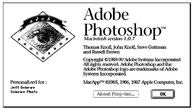
The evolution of the Photoshop splash screen starting from Photoshop 0.07 all the way up to CS2. [Link]
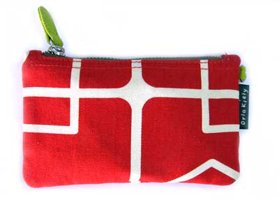
I found this really cool pouch which I use to put my my ipod cable, usb cable and USB bluetooth adapter in. Problem is both Nat and Rampurple think its girlish. I think its cool.

I was looking for apartments for sale in Montreal when I found one located in Habitat 67. I hadn’t heard of the place before but now that I read about it I think it would be a really funky place to live in. Habitat 67 which is pictured above was built in 1967 but it looks like it could have been built today. Here is some info I found on it on Wikipedia.
It was designed by architect Moshe Safdie based on his master’s thesis at McGill University. It was designed to integrate the variety and diversity of scattered private homes with the economics and density of a modern apartment building. Modular, interlocking concrete forms define the space. The complex was built as part of Expo ’67. The project was designed to create affordable housing with close but private quarters, each equipped with a garden. The complex was originally meant to be vastly larger. It also failed in its goal of being affordable as the building is today quite elite.
Anyway the apartment I found is a 3 bedroom flat and costs $399,000 Canadian. Its expensive for a 3 bedroom flat and I can’t afford it but its nice to know that a piece of architectural history can be purchased for that amount. Check out the Habitat 67 website for more pictures and info. [Link]
The blog is only a month old but already has some cool hacks including my favorite the audiophile cabinet. [Link]

What the hell happened here? Why can’t people just leave things alone?
I can’t believe another classic just bit the dust… [Link]