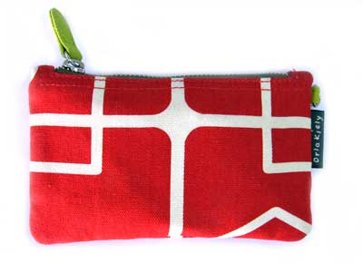
I found this really cool pouch which I use to put my my ipod cable, usb cable and USB bluetooth adapter in. Problem is both Nat and Rampurple think its girlish. I think its cool.
 2:48AM - Entertaining Kuwait since 2003
I found this really cool pouch which I use to put my my ipod cable, usb cable and USB bluetooth adapter in. Problem is both Nat and Rampurple think its girlish. I think its cool.

I was looking for apartments for sale in Montreal when I found one located in Habitat 67. I hadn’t heard of the place before but now that I read about it I think it would be a really funky place to live in. Habitat 67 which is pictured above was built in 1967 but it looks like it could have been built today. Here is some info I found on it on Wikipedia.
It was designed by architect Moshe Safdie based on his master’s thesis at McGill University. It was designed to integrate the variety and diversity of scattered private homes with the economics and density of a modern apartment building. Modular, interlocking concrete forms define the space. The complex was built as part of Expo ’67. The project was designed to create affordable housing with close but private quarters, each equipped with a garden. The complex was originally meant to be vastly larger. It also failed in its goal of being affordable as the building is today quite elite.
Anyway the apartment I found is a 3 bedroom flat and costs $399,000 Canadian. Its expensive for a 3 bedroom flat and I can’t afford it but its nice to know that a piece of architectural history can be purchased for that amount. Check out the Habitat 67 website for more pictures and info. [Link]
The blog is only a month old but already has some cool hacks including my favorite the audiophile cabinet. [Link]

What the hell happened here? Why can’t people just leave things alone?
I can’t believe another classic just bit the dust… [Link]

I’ve been searching for new sneakers recently but was disappointed with my usual brand’s new collection. So, I decided to give Nike iD a shot. For those of you who don’t know what Nike iD is, its basically a website for Nike that allows you to choose from a collection of sneakers and then you could customize the colors anyway you want. I managed to create 2 sneakers (pictured above) which I liked but I couldn’t buy because it turns out they require a US visa card for payment. Hopefully once U Shop We Ship launch their virtual Visa card I will order them. The prices are very decent also, a pair of the sneakers above which are customized by me cost only $60. Try it out. [Link]
Toot are having a design competition for the best designed blog and I want to win either second or third place. The first place prize doesn’t interest me since I already have more cameras then I need but I could definitely find a use for the iPod nano (second place) or the $50 gift voucher from Amazon (third place). So help me win second or third place by voting for my blog. Click the link to go to the voting page, it will just take you a second. [Link]
Super, Unleaded and Diesel. [Link]
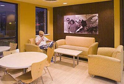
“After 30 years without a major design overhaul, the 51-year-old fast-food giant is adopting a hip new look. The world’s largest hamburger chain is redesigning its 30,000 eateries around the globe in a 21st century makeover of unprecedented scale.”
I checked out the slideshow of how the new McDonalds is going to look like and I think its going to come out pretty sweet. Lets hope they don’t fuck it up here and have the same people behind their crappy ad campaign design the interior. [Link]

There was a lot of origami talk in one of the threads in the forum so I thought I would share this insane origami with everyone. [Link]
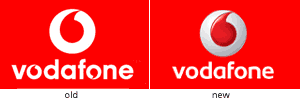
Sigh, another logo crosses over to the 3D button style. Just barely over a month ago I posted about Quarks new logo which looks like a button and now Vodafone went ahead and did the same thing. The new redesign looks OK even though I don’t like the 3D effect in general. I also prefer the new typeface since I used to think having the logo in place of the O’s was a bit too repetetive in the old logo so thats cool. In general though, they don’t make logos like they used to.

This is something I wanted to post about ages ago and I actually thought I had but seems I never did. Most of you by now have probably seen the new rebranded Baskin Robbins at the Marina Mall food court. I really dislike their new logo, I don’t like the new colors and I don’t like the new typeface. Maybe they are trying to target young children and thats why they rebranded but as an adult I prefer the older cleaner looking logo. I actually think the new logo reminds me of Halloween for some reason..
what is typogenerator?
typoGenerator is a random generator for ‘typoPosters’. a typoPoster is a poster, created from images and letters/text that doesnt have any sense, just to look good
how does typogenerator work?
the user types some text; typoGenerator searches images.google for the text and creates a background from the found images, using randomly chosen effects. then it places the text, using random effects too.
[Link]
On my Mac in Internet Explorer 248pm.com looks a bit strange. The titles of the post are too big for one and some other minor bugs. Could you please compare what you see to the screenshot of how it “should” look like and tell me if you are seeing things differently. Thanks
update: I “think” I solve the problem..
I just checked CNN.com and they have redesigned their main page. Looks interesting so far.. although I find it sticking too much to the left hand side, its going to be hard to get used to it. [Link]