
A cool site with a huge catalog of information on company logos, their colors and their text treatments. [Link]
Category: Design
Categories
A Website about Corporate Identity
Categories
Lost Brothers

Anyone notice the similarities between the Lost and Band of Brothers posters? Very Strange..
It seems every company that redesigns their old logo ends up with one thats worse then the original. AT&T anyone? I think the new Kodak logo lacks personality and uniqueness. It looks older then the logo its replacing. Classics should not be messed with. [Link]
This is an Excel file with 200 logos in it. The aim of this test is to try and name the brands which belong to the logo. I was able to guess 83 right and ended up with a 42%. There were a couple of logos which looked really familiar but I just couldn’t remember who they belonged to which made things really frustrating but still very fun. [Link]
Categories
The End

Bye bye Emigre… [Link]
Categories
BBK Logo
 Back in May I posted about the new BBK logo but I didn’t know who had designed it. Well today John Avery commented on that old post and it turns out the logo was designed by his agency, Financial Design in the UK in collaboration with their associates in Bahrain, Vision. Mystery solved.
Categories
Eric Spiekermann Blogs!
Eric Spiekermann designer of my second favorite typeface Meta has a fucking blog! Most of his posts are posted in German and English which makes things easy for me since I neither speak nor read German. My favorite typeface is Frutiger by the way which was designed by Adrian Frutiger. A good friend of mine was very lucky to have met him at a design conference. When he was introduced to Adrian Frutiger he told him that Frutiger was his favorite typeface, Adrian replied asking him at what point size, my friend replied saying 9 ofcourse.
Anyway here is Eric’s blog. [Link]
Categories
Wieden + Kennedy Offices
Comparing my ad agencies office to Widen + Kennedy’s office is so fucking sad. Why can’t I work in a place like that! I want a bigger desk! Lots of pictures after the jump [Link]
I just realized that Evolt redesigned their website. I stopped checking the site in the summer because it wasn’t being updated due to the redesign but now 5 months later the site is back up but I really hate the new look. The old design looked way better in my opinion plus the articles were much easier to read. Luckily I am not the only one who hates their new design and many users have left their feedback on this issue. Hopefully they will read them and fix things up. [Link]
Categories
Serene Mobile Phone Sucks
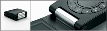
What the fuck happened to B&O?? This has to be the ugliest and least practical item designed by them ever. Its fugly! [Link]
Categories
Motel Signs

A nice collection of Motel Signs from various parts of the US. I always wanted to stay at a Motel for some reason but I never got the chance, I guess since you see it so much in the movies and we really don’t have any similar places in Kuwait it becomes like something you can’t have which makes you want it more. [Link]
Categories
The Design Encyclopedia
The Design Encyclopedia is a growing, collaborative resource that describes, tracks and explains culture, commerce, politics, media, sports, brands – everything possible, really – through design. [Link]
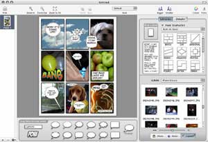
This is a cool mac app I just downloaded. The application is called Comic Life and allows you to easily create comics using your pictures and text. Its VERY EASY to use and has numerous options for a variety of layouts and balloons. I was easily able to create a stupid but really cool looking comic in like less then a minute since it automatically loaded up my iPhoto pictures automatically in the sidebar and allowed me to just drag and drop images into the layout. You can download it and try it and its only 4MB. [Link]
I am currently updating the website’s theme slightly. If things look a bit off its because its not final yet.