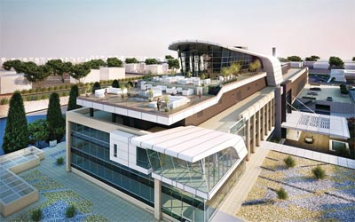
Back in 2008 I posted about how Missoni Hotel was going to open up here in Kuwait and yesterday I was lucky enough to get a sneak peek tour of the place.
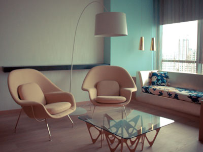
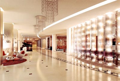
I noticed two things when I first walked into the lobby, the first was the amount of colors that filled the place and the second was the cleaning lady vacuuming using a Dyson. The hotel is full of beautiful summer colors and wild fabric designs that magically seem to all work together. I spent the whole time amazed at how tasteful everything was put together, it’s just incredible the amount of thought and work that went into it.
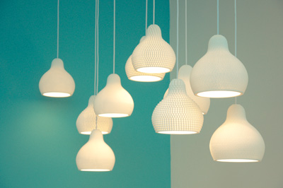
The second thing I noticed as I mentioned earlier was the Dyson vacuum cleaner but I then also spotted Bang & Olufsen speakers in the lobby ceiling followed by Bang & Olufsen TV’s in the hotel rooms. I even spotted Bodum toasters and very cool looking pots and pans in one of the hotel rooms mini kitchenettes. It’s a hotel that’s design driven, from the typeface the hotel room numbers are written in to the power plug sockets in the wall, everywhere you look you see good design which is very rare to see here in Kuwait.

They have 169 rooms so it’s not a small boutique hotel and the majority of their staff are from Italy so really once you walk into the hotel you could easily forget you were in Kuwait. The rooms had some very beautiful furniture which I right away asked if they were going to be available for purchase (turns out they will be). The hotel launches March 1st and they’re located in Salem Mubarek Street opposite American University of Kuwait in the same building where Symphony Mall is. I shot the pictures in this post but they will be sending me some more pictures which I will add to this post once I get them.
Update: Arabian Business has some more pictures which you can check [Here]