Categories
Apple Apps Design Information

Bye Bye Suitcase

FontExplorer

For the past couple of years I have been forced to use Extensis Suitcase to manage the fonts on my Mac. There was one serious competitor and Extensis ended up acquiring it. Awhile back I found out Linotype released a beta version of their own font manager software called FontExplorer X. I went ahead and tried it out and it was a bit buggy and had some features missing so I removed it and continued using Suitcase. A couple of days ago Linotype released the final version of their software so I downloaded it and ever since then I haven’t gone back to Suitcase.

FontExplorer is wayyy faster, has more features, and best of all its fucking free! Its FREE! Suitcase costs $100 and I see no reason why I should pay that much for a software that doesn’t perform better then the free FontExplorer. So what I am trying to say here is if you are a designer and frustrated with Suitcase, download FontExplorer, its lightyears ahead and so much more cooler.. [Link]


Categories
Design

Quark redesigns logo.. again!

quark

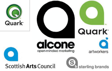
Back in September, Quark, the company behind one of the most popular publishing software’s released a new redesigned logo. It wasn’t a bad idea if it wasn’t for the fact that their redesigned logo looked like a copy of many other logos. The design industry was very critical on Quarks redesign and it seems it must have gotten under their skin because Quark just released another newer logo. I personally don’t like their latest redesign, it looks like a button. [Link]


Categories
Design Music

TheKNOCKOFF*PROJECT

Album cover spoofs, goofs, tributes, send ups, near misses and coincedences. This is the all-new Knockoff*Project. There are over 100 new knockoffs… stashed all over the place. [Link]


Categories
Design Information Kuwait

Commercial Bank of Kuwait Logo

Commercial Bank of Kuwait logo

Many of you might not know this but the Commercial Bank of Kuwait logo was designed by one of the best design agencies in the world, Pentagram back in 1979. Not only that but the designer who worked on the Commercial Bank identity, Alan Fletcher, is also among the most influential figures in British graphic design history. I decided to share with you what Alan Fletcher said about the Commerical Bank project back in the 1980’s and also the idea behind the logo itself.

The text below was written by Alan Fletcher

Designing in the Middle East requires certain cultural adjustments to one’s normal working pattern and lifestyle. The Gulf States are seven hours’ flying time from London with a time difference of three hours. Travel by Arabic airlines is like arriving in the Gulf before you’ve left. It’s a dry journey – no alcohol. At midday, Muslim passengers are likely to say prayers prostrated in the aisle; one wonders about the flight deck! Normal working hours are 8.00 am to 1.00 pm, and even then a government survey indicated that the oil-rich Kuwaiti only works an average of ten minutes each day. Friday is a holiday but they work Saturday instead. Appointments, are not necessarily appointments, and frequently involve hours (if not days) of waiting.

The Commercial Bank of Kuwait had catered only for institutions and businesses within the Gulf States until it decided to expand into international markets and enter retail banking. The new policy created the need for an appropriate visual identity. Since the bank had neither the experience nor resources, it appointed Tony Vines, via Ogilvy and Mather, New York, to set up a marketing department and create a new identity within eighteen months. Vines flew to London in 1979, interviewed various advertising agencies and designers, and on reaching a rapport with Pentagram commissioned us to work on the program. His fast response to locating a design resource set the pace for the hectic schedule that followed.

In architecture the term ‘fast tracking’ describes the method of designing whereby the architect keeps one jump ahead of the builder. In this case the severe deadlines and cultural differences made it more of a jump in the dark. The brief stipulated that the corporate identity and design style should be Arabic in flavor, but be understood internationally. The symbol, in particular, was required to mean something to both an Arab and a Westerner. Designing within these constraints reduced the normal available options. The two different scripts precluded using the alphabet to form a logotype such as Unisys, or initials such as IBM. An abstract mark would take too long to establish. A pictorial device might have encouraged the client to insist on a heraldic solution such as a scimitar crossed with palms. However the design of the symbol proved to be the least of the problems. Designing from right to left, in a script and language one didn’t understand, and within an unfamiliar culture, required keeping one’s head fast on its feet.

The new Commercial Bank symbol is an amalgamation of calligraphy and image. the words commercial and bank are rendered in kufic, a geometric script, to make a decorative star, recognizable by anyone as a distinctive pattern and, additionally, readable to an Arab. The dual language identity has English type in Paul Renner’s Futura with a compatible Arabic script especially drawn by Ahmed Mustafa.




Categories
Design

A Website about Corporate Identity

A cool site with a huge catalog of information on company logos, their colors and their text treatments. [Link]


Categories
Design Strange Television

Lost Brothers

Lost Brothers

Anyone notice the similarities between the Lost and Band of Brothers posters? Very Strange..


Categories
Design Personal

Kodak’s New Logo

New Kodak Logo

It seems every company that redesigns their old logo ends up with one thats worse then the original. AT&T anyone? I think the new Kodak logo lacks personality and uniqueness. It looks older then the logo its replacing. Classics should not be messed with. [Link]


Categories
Design Fun

Logo Test

This is an Excel file with 200 logos in it. The aim of this test is to try and name the brands which belong to the logo. I was able to guess 83 right and ended up with a 42%. There were a couple of logos which looked really familiar but I just couldn’t remember who they belonged to which made things really frustrating but still very fun. [Link]


Categories
Design Mags & Books

The End

Emigre 69

Bye bye Emigre… [Link]


Categories
Design Information

BBK Logo

Back in May I posted about the new BBK logo but I didn’t know who had designed it. Well today John Avery commented on that old post and it turns out the logo was designed by his agency, Financial Design in the UK in collaboration with their associates in Bahrain, Vision. Mystery solved.


Categories
Design Interesting

Eric Spiekermann Blogs!

Eric Spiekermann designer of my second favorite typeface Meta has a fucking blog! Most of his posts are posted in German and English which makes things easy for me since I neither speak nor read German. My favorite typeface is Frutiger by the way which was designed by Adrian Frutiger. A good friend of mine was very lucky to have met him at a design conference. When he was introduced to Adrian Frutiger he told him that Frutiger was his favorite typeface, Adrian replied asking him at what point size, my friend replied saying 9 ofcourse.

Anyway here is Eric’s blog. [Link]


Categories
Design

Wieden + Kennedy Offices

cool office

Comparing my ad agencies office to Widen + Kennedy’s office is so fucking sad. Why can’t I work in a place like that! I want a bigger desk! Lots of pictures after the jump [Link]


Categories
Design Geek Internet

Evolt Redesign

I just realized that Evolt redesigned their website. I stopped checking the site in the summer because it wasn’t being updated due to the redesign but now 5 months later the site is back up but I really hate the new look. The old design looked way better in my opinion plus the articles were much easier to read. Luckily I am not the only one who hates their new design and many users have left their feedback on this issue. Hopefully they will read them and fix things up. [Link]


Categories
Design

Serene Mobile Phone Sucks

serene

What the fuck happened to B&O?? This has to be the ugliest and least practical item designed by them ever. Its fugly! [Link]


Categories
Design Interesting

Motel Signs

motel signs

A nice collection of Motel Signs from various parts of the US. I always wanted to stay at a Motel for some reason but I never got the chance, I guess since you see it so much in the movies and we really don’t have any similar places in Kuwait it becomes like something you can’t have which makes you want it more. [Link]