I got a new car over the weekend and today I went to transfer it into my name but like everything dealing with the government, it always turns out to be a complicated and adventurous process.
Me and the previous owner of the car who’s a friend of mine first went to the Government Mall (thats what its called) to do the transfer there. Once we went in they told us if the car has old plates we need to go to 3aseema branch and do the transfer from there.
So we drive all the way to the end of the 4th ring road where the 3aseema branch is located and after running around from window to window, they told us because I live in Salmiya we need to go to the Meidan Hawalli branch.
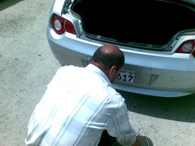
So we turn around and drive back all the way to the other end of the 4th ring road to the Median Hawalli branch. After signing a paper the car got transfered into my name and we went to collect the new plates. I don’t know how the system works but my plate number turned out to be 11617 which I am guessing means the person 6 places ahead of me ended up getting 11611 which would have been a pretty cool number to have. If I was one place ahead even I would have ended up with 11616 which would still have been pretty nice.
On my way back to the car there were a bunch of people outside that offered me the service of installing the plates for me. The plates don’t come with any holes so for KD1 they will make the holes and fit the plate on to the car. This whole process of running around from place to place took around 2 hours and a half!