
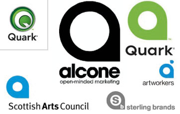
Back in September, Quark, the company behind one of the most popular publishing software’s released a new redesigned logo. It wasn’t a bad idea if it wasn’t for the fact that their redesigned logo looked like a copy of many other logos. The design industry was very critical on Quarks redesign and it seems it must have gotten under their skin because Quark just released another newer logo. I personally don’t like their latest redesign, it looks like a button. [Link]


