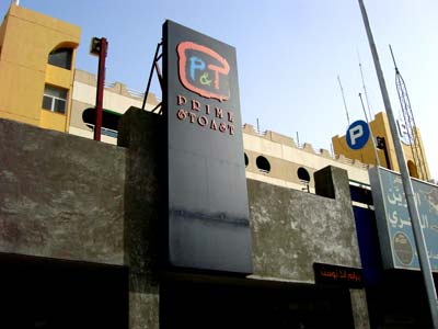

Today I decided to pass by Prime & Toast and try their burger since it was recommended by a few readers. It was my first time there and I was eager to see what they had to offer. It was 3PM, I was hungry and a good burger is exactly what I needed.
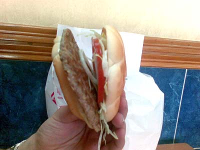
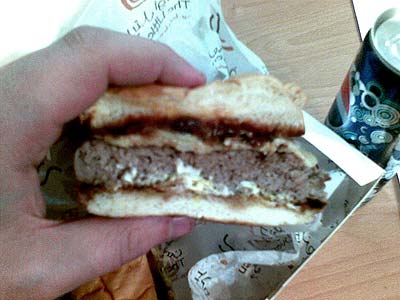
They only had one burger on the menu so I ordered it medium well. Twenty minutes later my burger arrived looking pretty cool. The presentation of the burger was impressive, it was big, came on a small wooden plank and had a good amount of fries on the side. I quickly dug into the burger really expecting to be stunned by the flavor but instead I was greeted with a messy burger that just tasted too complicated.

The Prime Burger as its called on their menu is made up of the bun, cherry tomatoes, rocket lettuce, mushrooms, cheese and a meat patty with some kind of red colored spice covering it. The problem I had was that I couldn’t really taste the burger. The mushrooms and baby tomatoes were cut up into large chunks so their taste was overpowering the patty. If that wasn’t bad enough the strange spice that was part of the burger really just confused things. The burger just felt fake, like they tried really hard to make it special. I was very disappointed, I had just plunked down KD5.750 for a burger that didn’t taste like a burger.
I really wanted to give the burger a good score, it had everything needed to be a great burger. It looked good and was pretty big in size but the taste let it down. I wanted to at least give it a 3.5 or even a 3 but the thing is, I wouldn’t have the burger ever again, even if it was for half the price that still wouldn’t be enough to entice me into having it again. Not that price is playing a role in these burger reviews but its just something I was thinking to myself to see if it was the price that was putting me off. The burger wasn’t exciting and I really wanted a thicker patty just so that I could at least taste the meat. And whats with their red powdery spice they cover everything with? It was on my burger and all over the fries. Pretty weird. The final score for their burger is a 2.5 out of 5. The place is nice and cozy but I wouldn’t go back for their burger.


Prime & Toast is located on the Gulf Road opposite the Seef Palace
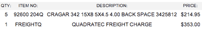
The cost of the Prime Burger is KD5.750